

February 2023 to March 2023
Context
This project was done in response to IterateUX’s February - March 2023 Design Challenge.
The Prompt
E-Commerce Apparel Shopping Experience Product Design OR Re-design (website and/or mobile):
Choose between tackling an existing e-commerce apparel shopping re-design or designing a new experience of your own! Shopping for apparel online can be time-consuming and frustrating - brainstorm solutions and create a streamlined and intuitive apparel shopping/browsing/searching/comparing experience for your customers, incorporating an AR (augmented reality) feature.
Solution
Our team explored the glasses space of e-commerce since AR technology has already been quite prevalent in this area, and identified a few pain points that users had regarding online shopping.
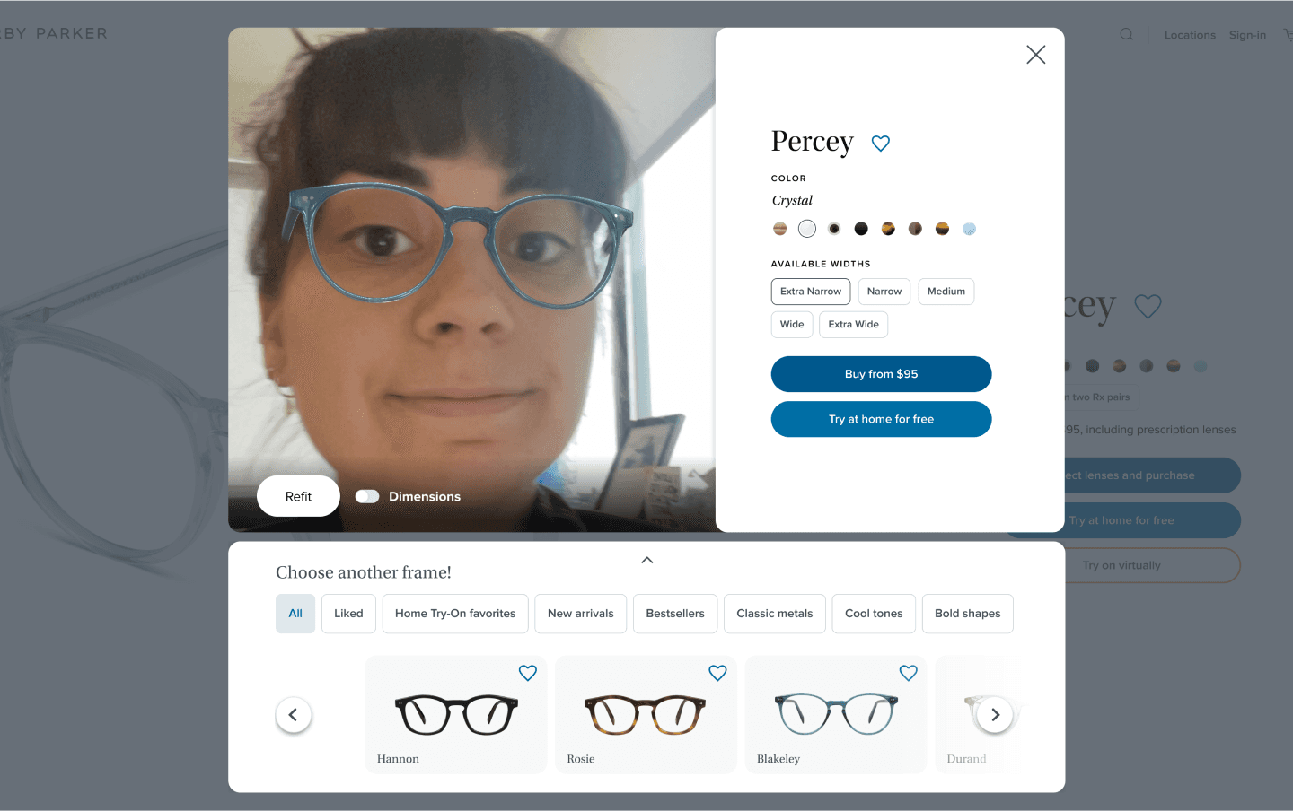
We decided to redesign Warby Parker to address the problems we found previously - mainly reducing distrust in AR and online shopping as a whole as well as creating a smoother and more intuitive flow for browsing and purchasing glasses frames.

Team
Our team consisted of me alongside three other designers - Caroline Blodi, David Mercer, and Katherine Vittini.
Main Contributions
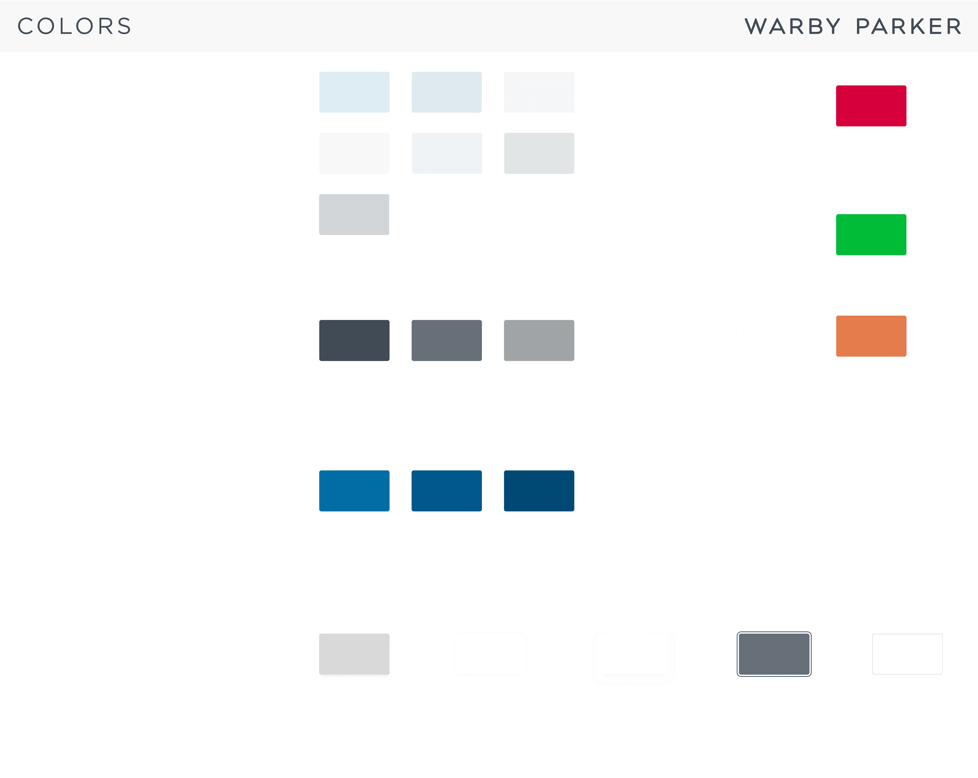
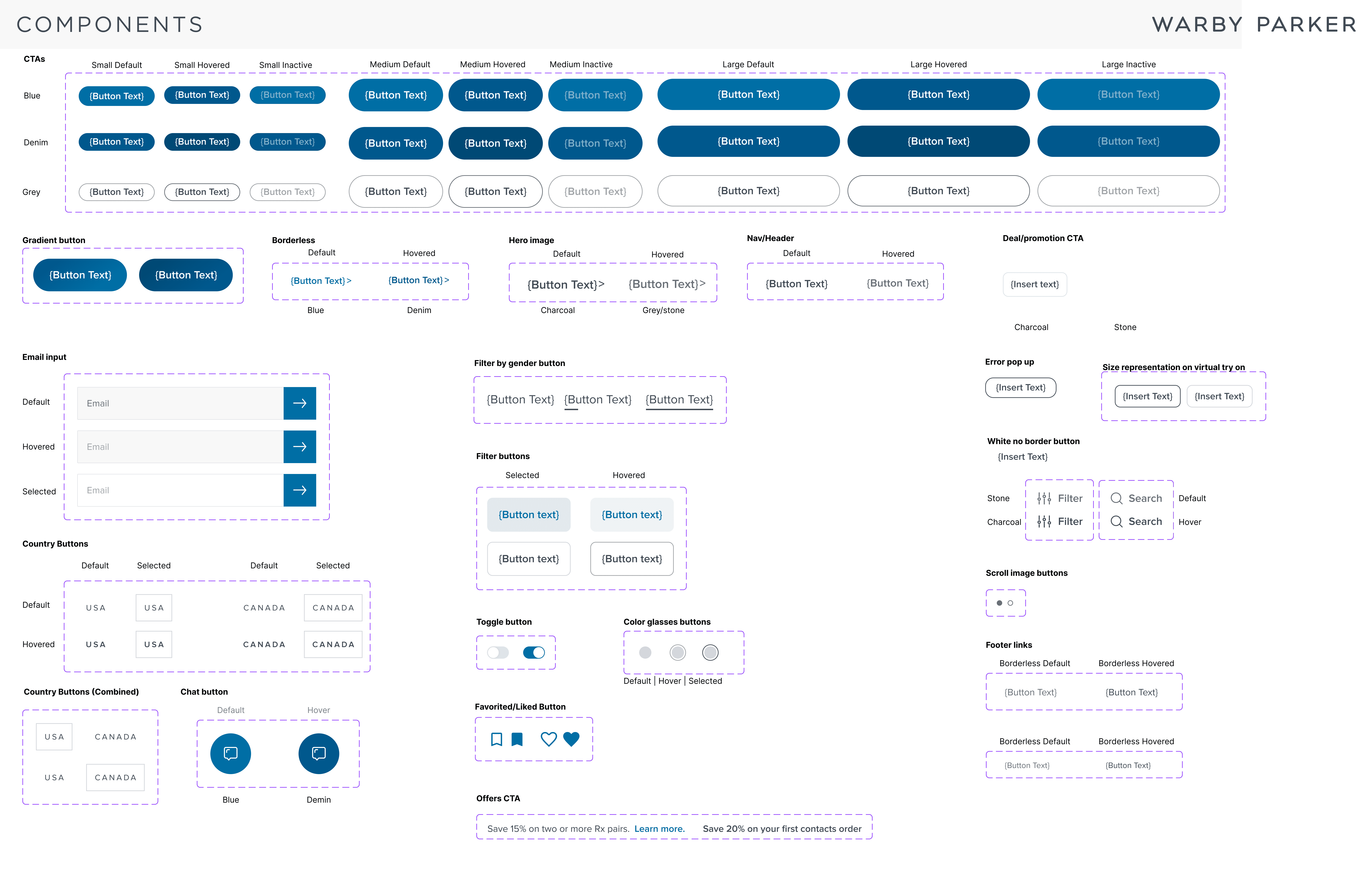
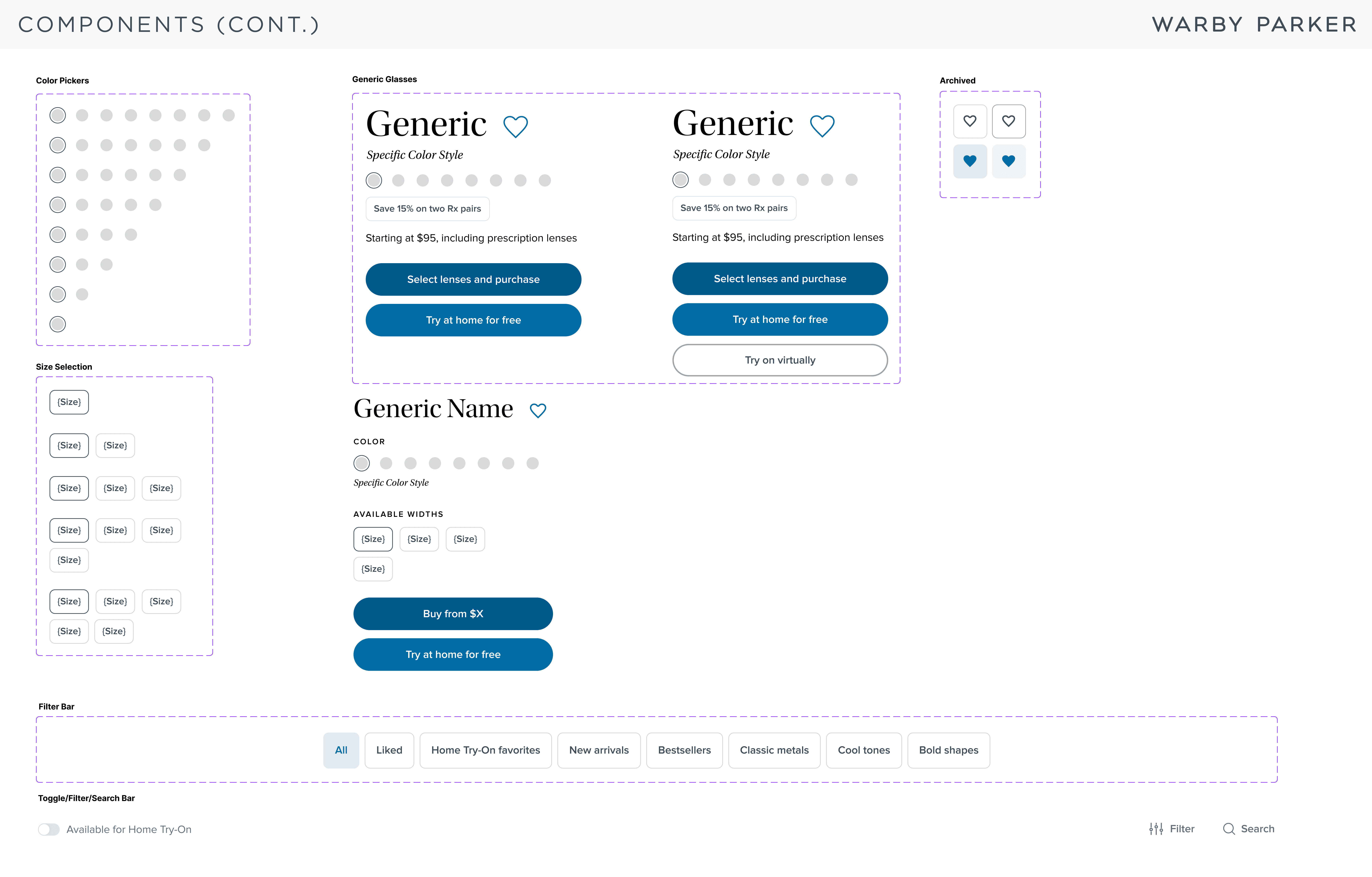
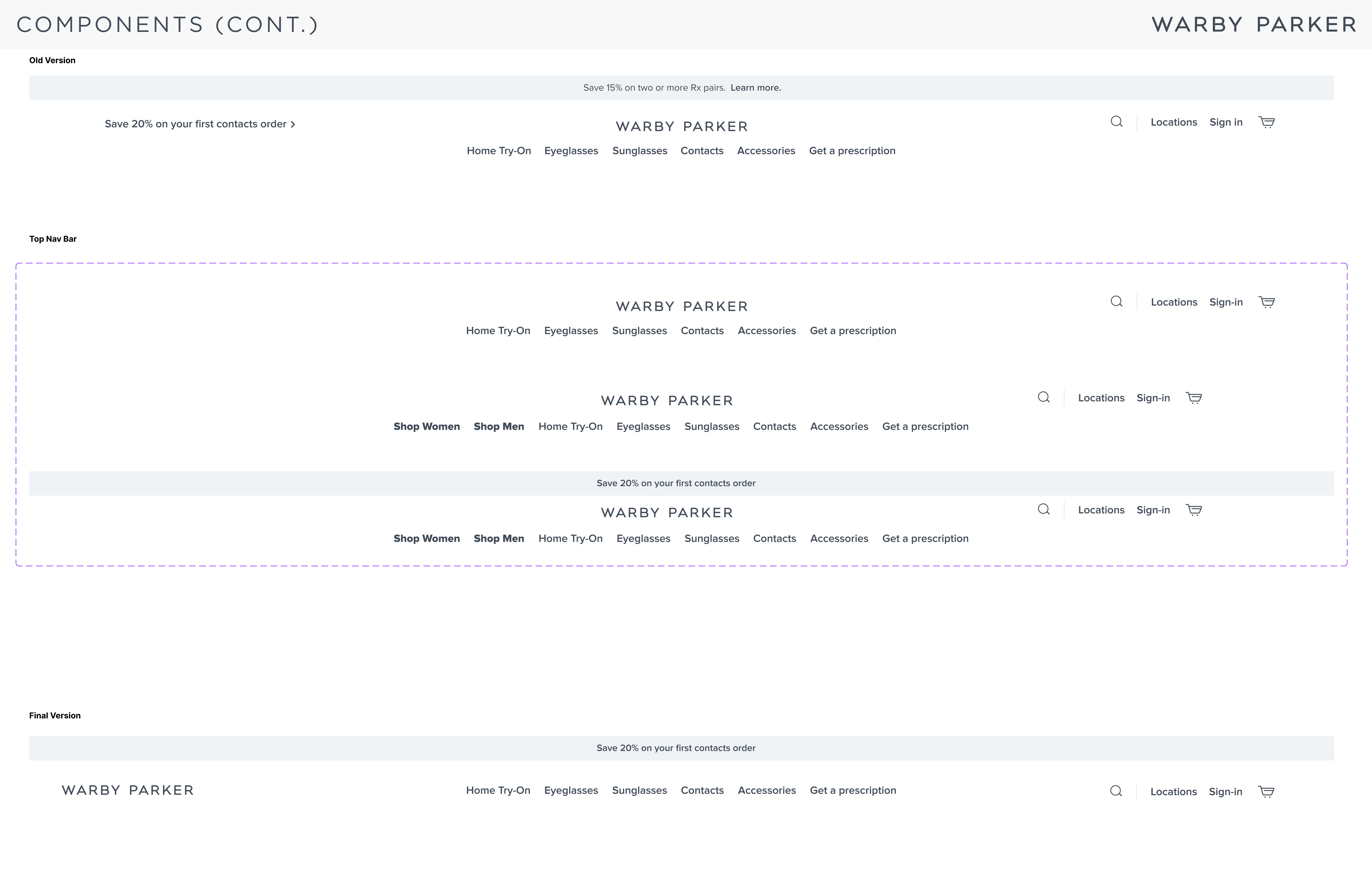
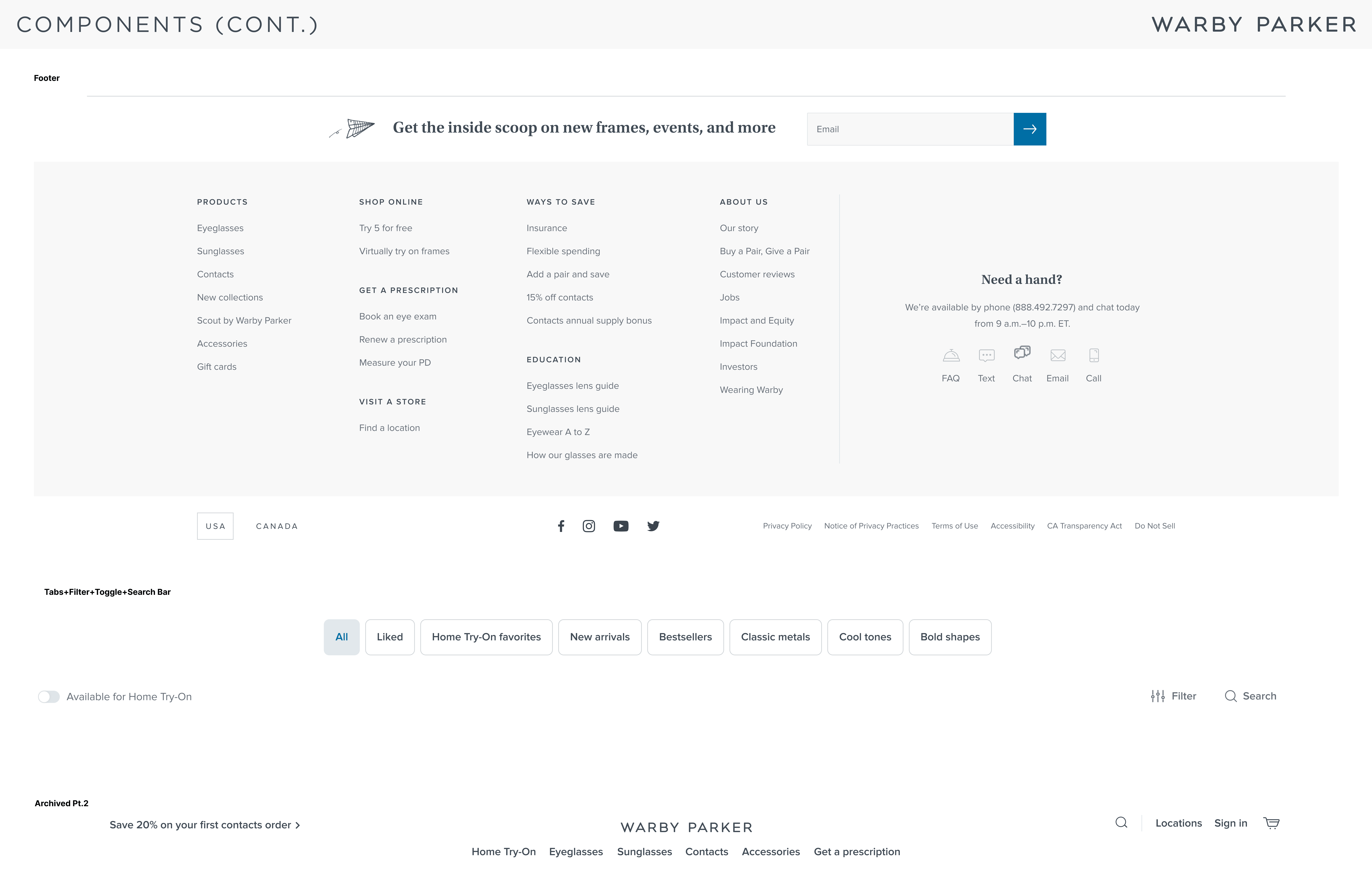
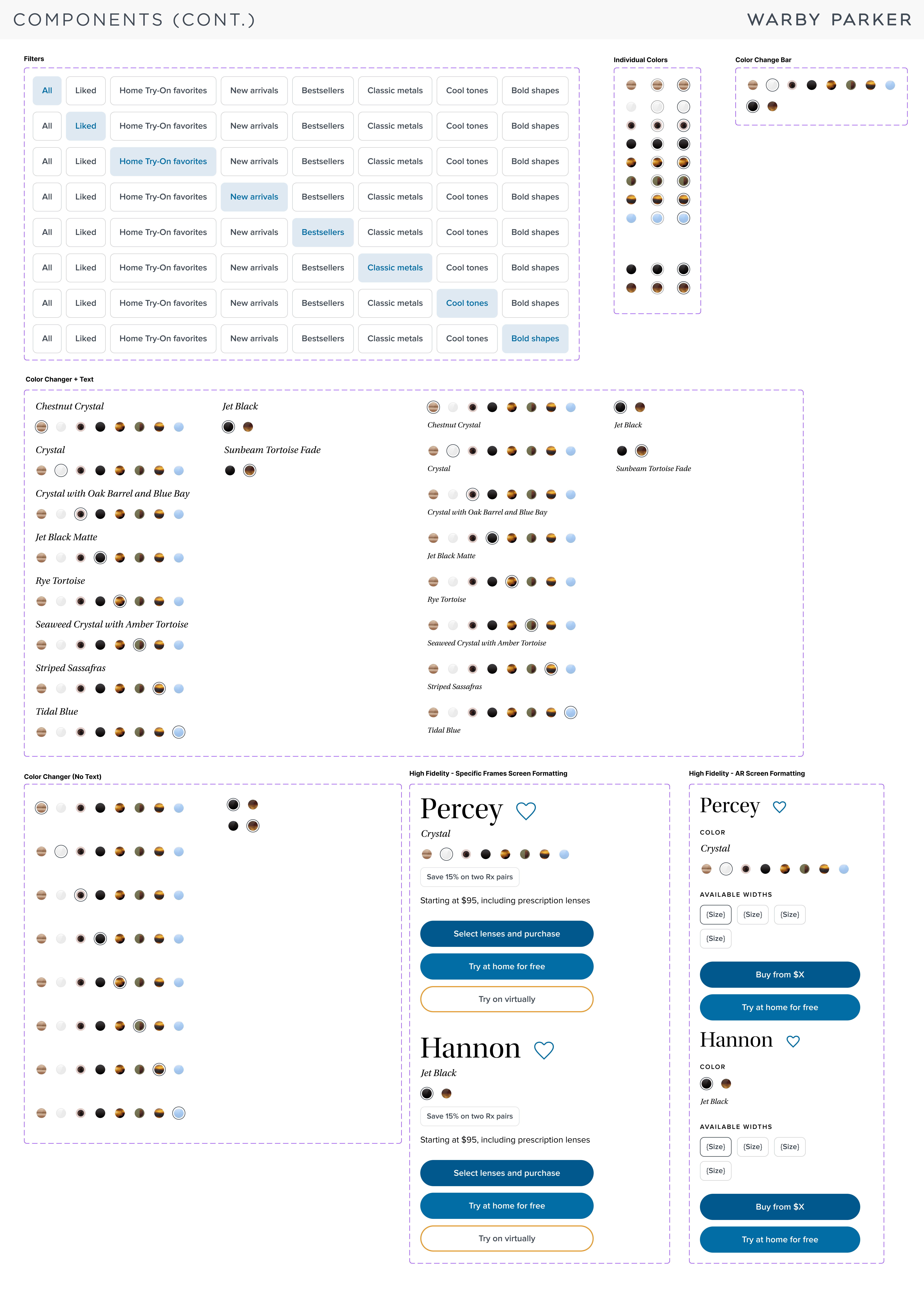
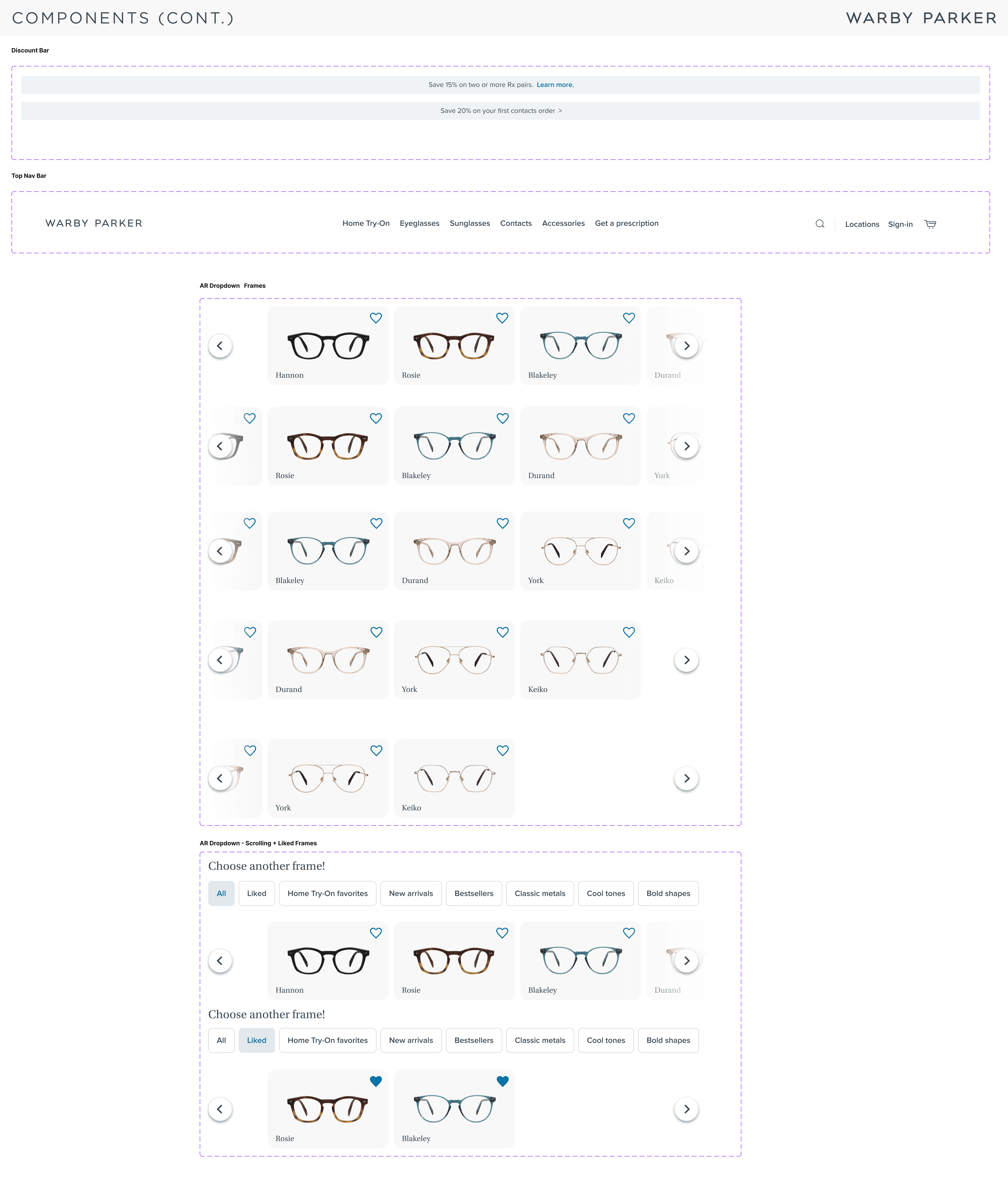
I collaborated with Katherine to understand and build out Warby Parker's existing design system to the best of our abilities as well as create components that would serve as the building blocks to our prototype. You can see more of our design system below.
Full process below
Main Contribution 1: Design System
We slowly built out Warby Parker's design system using the inspect tool on our browsers.

We then built out components to help build out our future prototype.
Main Contribution 2: Personas
We conducted 4 user interviews with people who generally have trouble while shopping for clothing and apparel online to identify potential pain points.
User Interview Key Findings:
Users place high value on measurements/dimensions listed when shopping online, but are concerned about lack of consideration for varied body types
Varied opinions on in-store/online shopping preference
In-store preference is based on lowering risk of purchasing incorrect size and avoiding need for returns in the case of ordering incorrect size, as well as ability to view many options easily
Online preference is based on the disorganization of too many options available in-store, and subsequent overwhelm
Most users are not familiar with utilizing AR in the context of online shopping, but are interested in learning more and see the potential in AR solving sizing issues of online shopping. One user is not interested in utilizing AR for online shopping.
One user pointed out the desire to view all items of interest on one specific screen while online shopping
We created two user personas based off of our five user interviews to create generalized representations of our target audience/customers. This would allow us to generate empathy and focus on their needs and motivations.
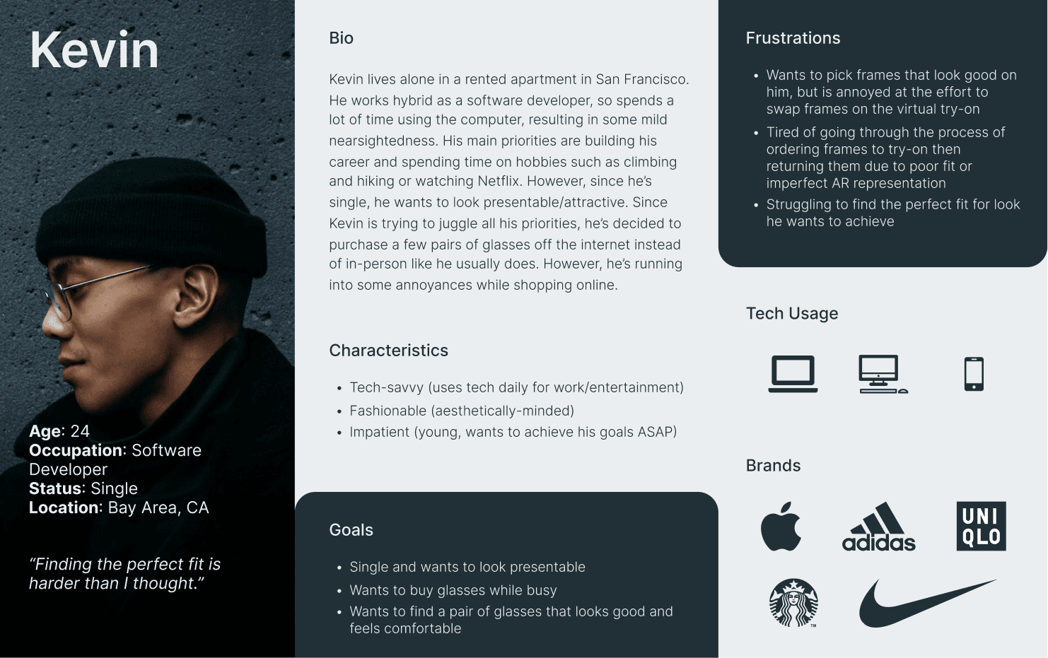
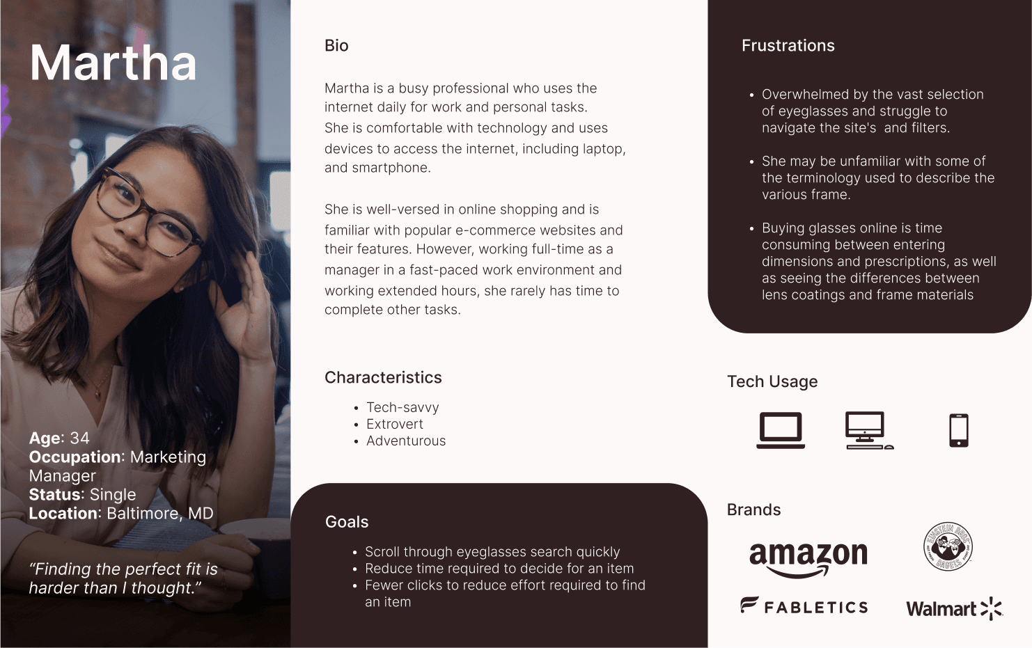
Image: Personas created
The Rest of the Process - Research
We looked at 4 brands’ websites and 1 brand’s mobile app to evaluate their AR virtual - try on experiences. The brands were: Warby Parker (website and mobile application), Zenni Optical, LensCrafters, and Eyebuydirect.
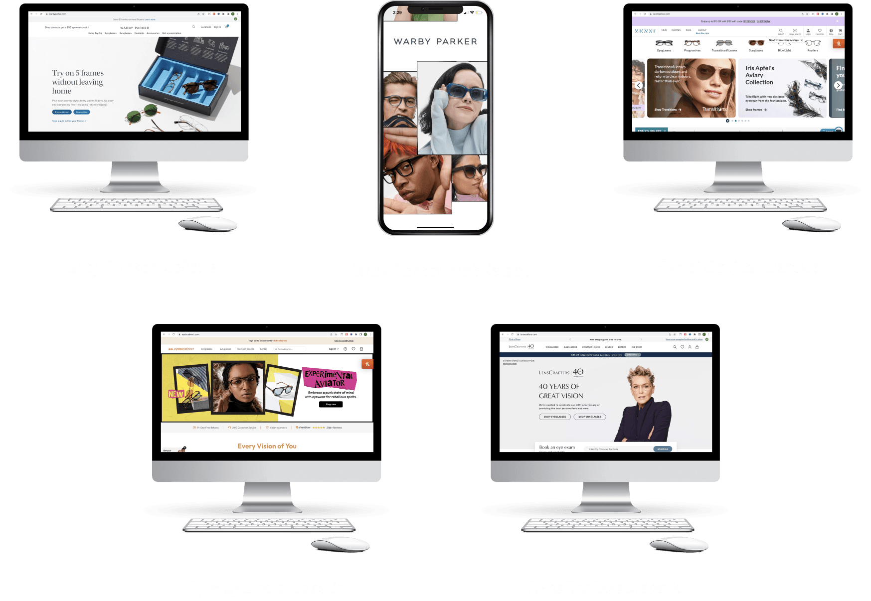
Image: Personas created
Through analyzing each of these apps, we found that AR functionality had a lot of room for improvement on most of these websites, and the Warby Parker mobile app most closely emulated the in-store shopping experience in terms of the ability to easily try on multiple pairs of frames and accurately see how they look on the users’ face, as well as favorite particular frames to come back to later.
The Rest of the Process - Define
Apart from the personas created above, we also created customer journey maps in order to better visualize a how a customer interacts with existing e-commerce platforms and identify potential intervention points in the process.
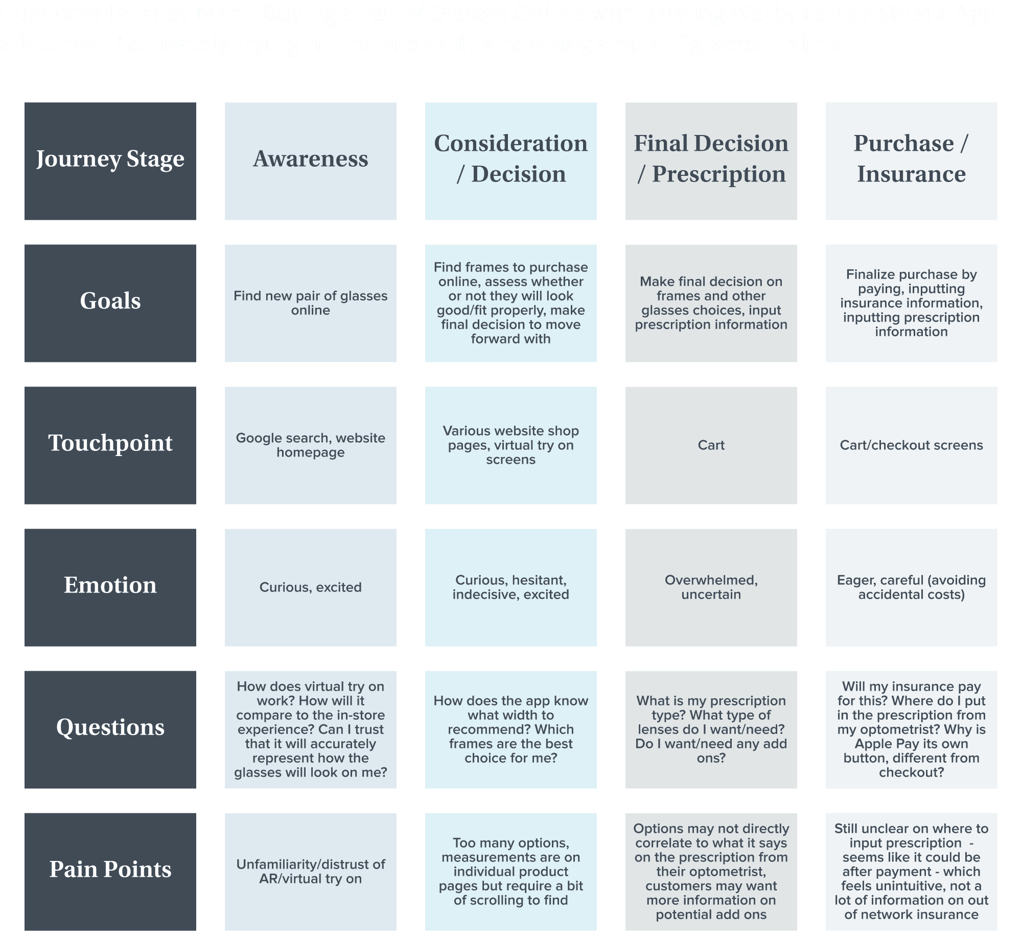
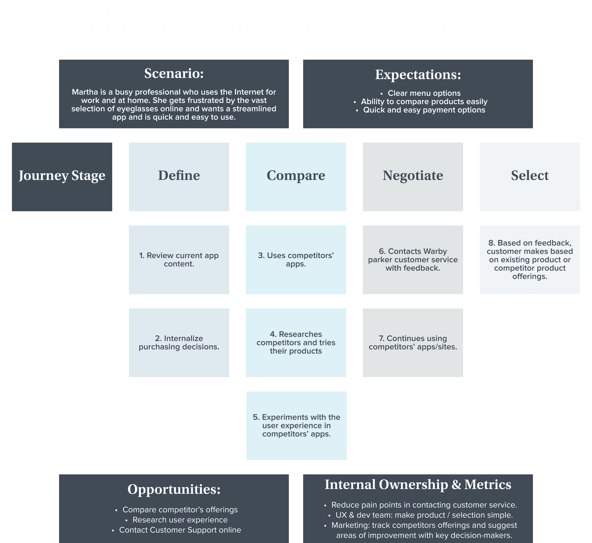
Image: Customer Journey Maps
From the personas and customer journey maps, we finally arrived at two main How Might We statements that we would address with our solution.
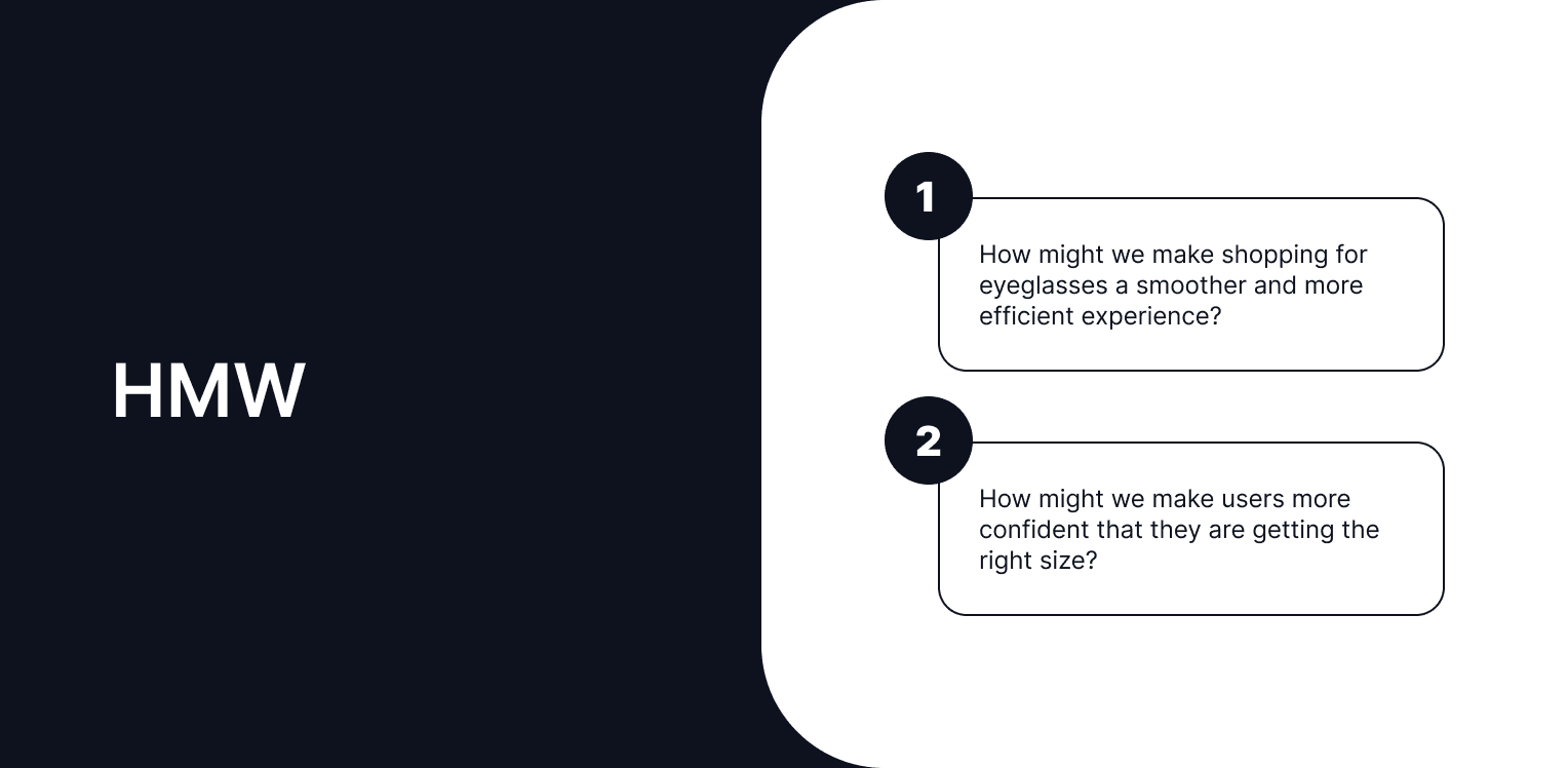
Image: Personas created
The Rest of the Process - Ideate & Prototype
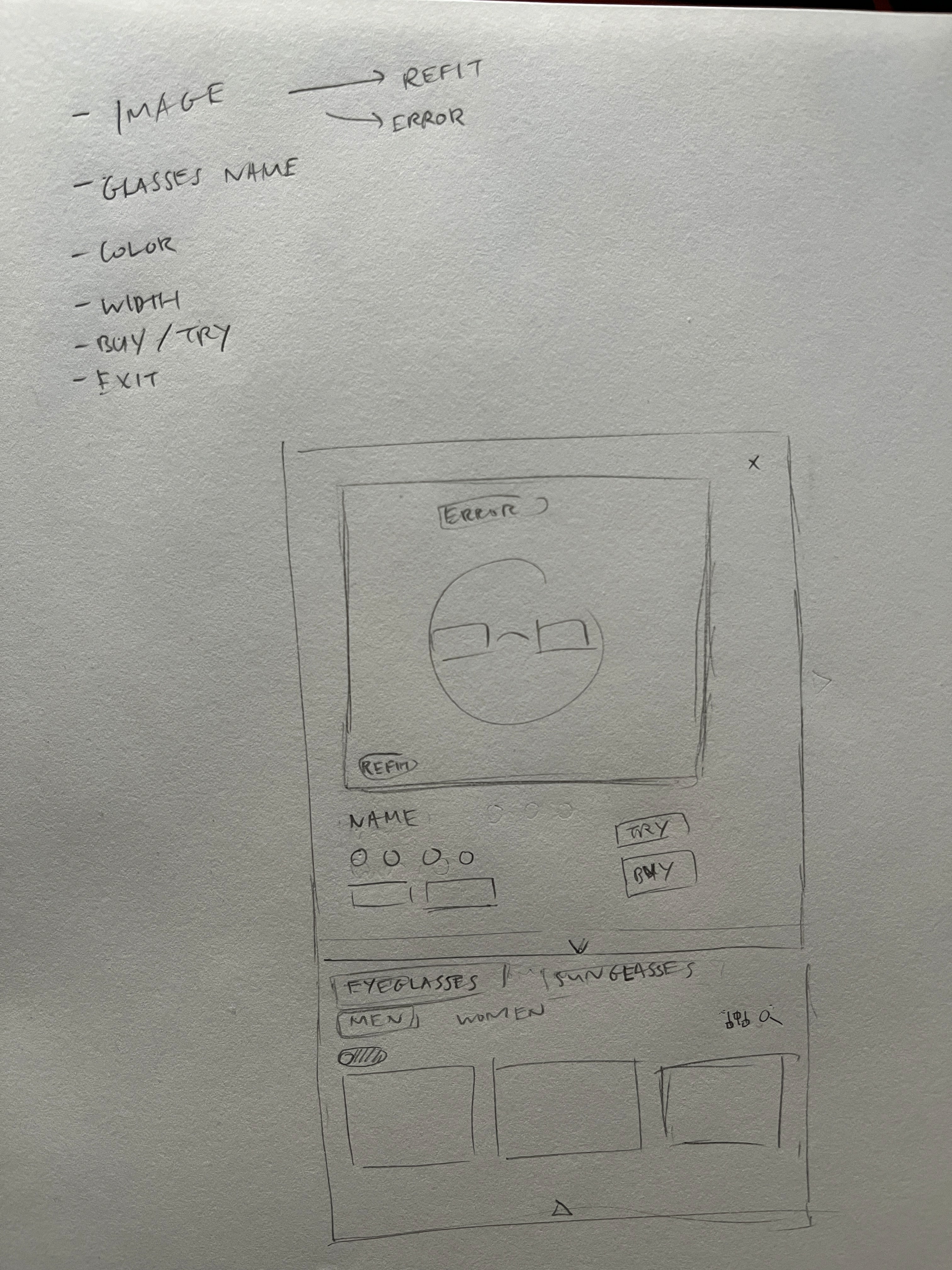
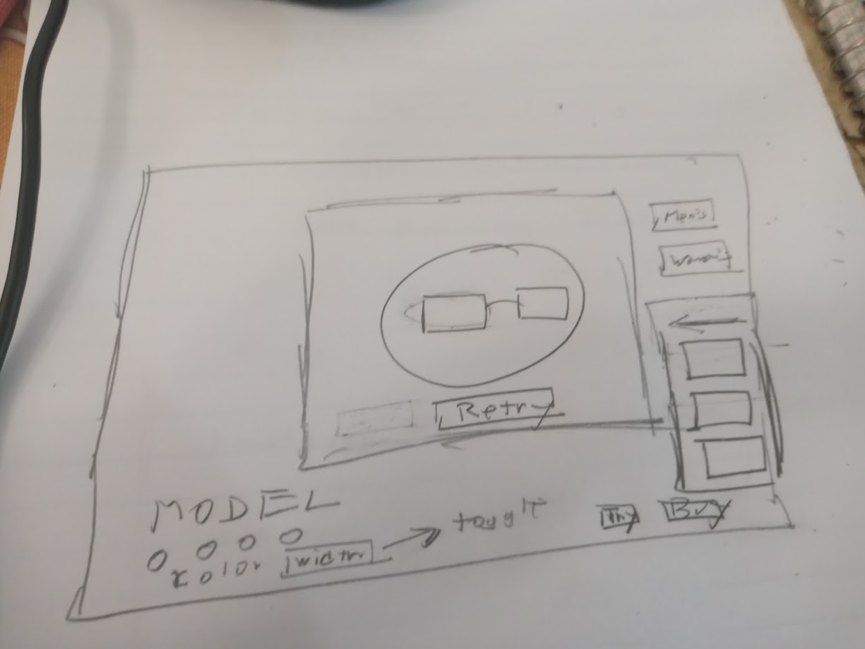
Sketches
Our sketches were rough approximations of the native in-site web apps we wanted native to the overall Warby Parker site. The two sketches laid the ground work in our design process. In the end, we opted to use most of the features of the sketch on the left for its simplicity and clear design, an upgrade from the current Warby Parker user experience.
Wireframes
We created wireframes focusing on the Virtual Try-On (AR) feature - adding the ability to switch between frames with the “Choose Another Frame” feature, and ability to “Like” frames to reference at a later time.
Once the wireframes were complete, we created a high fidelity mockups of these screens.

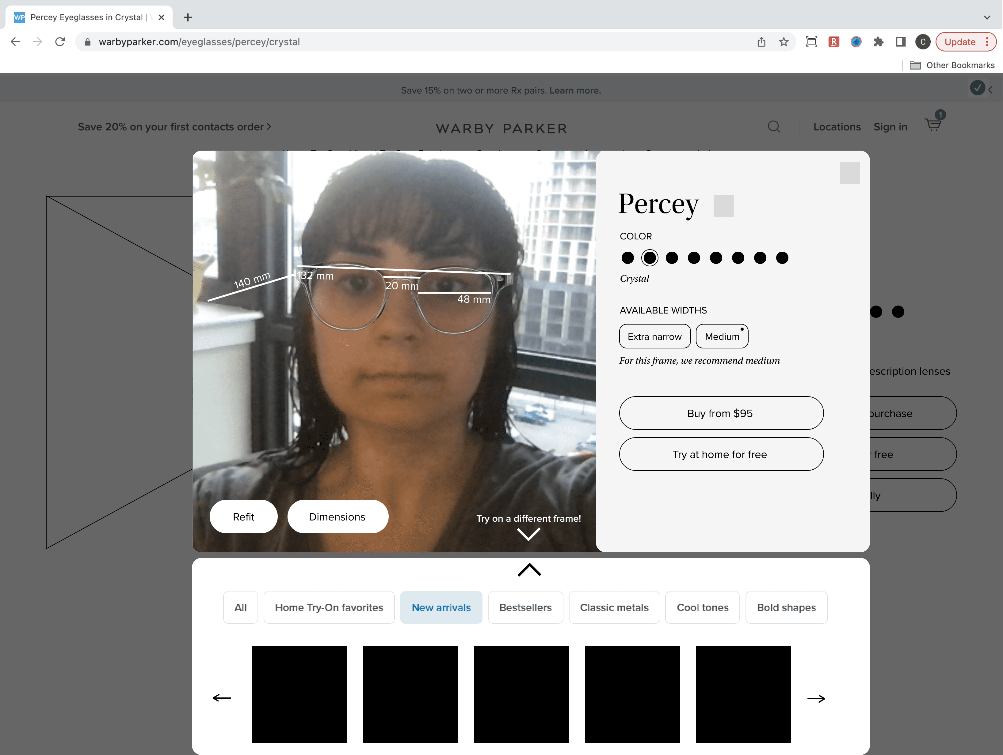
Image: Wireframing
High Fidelity
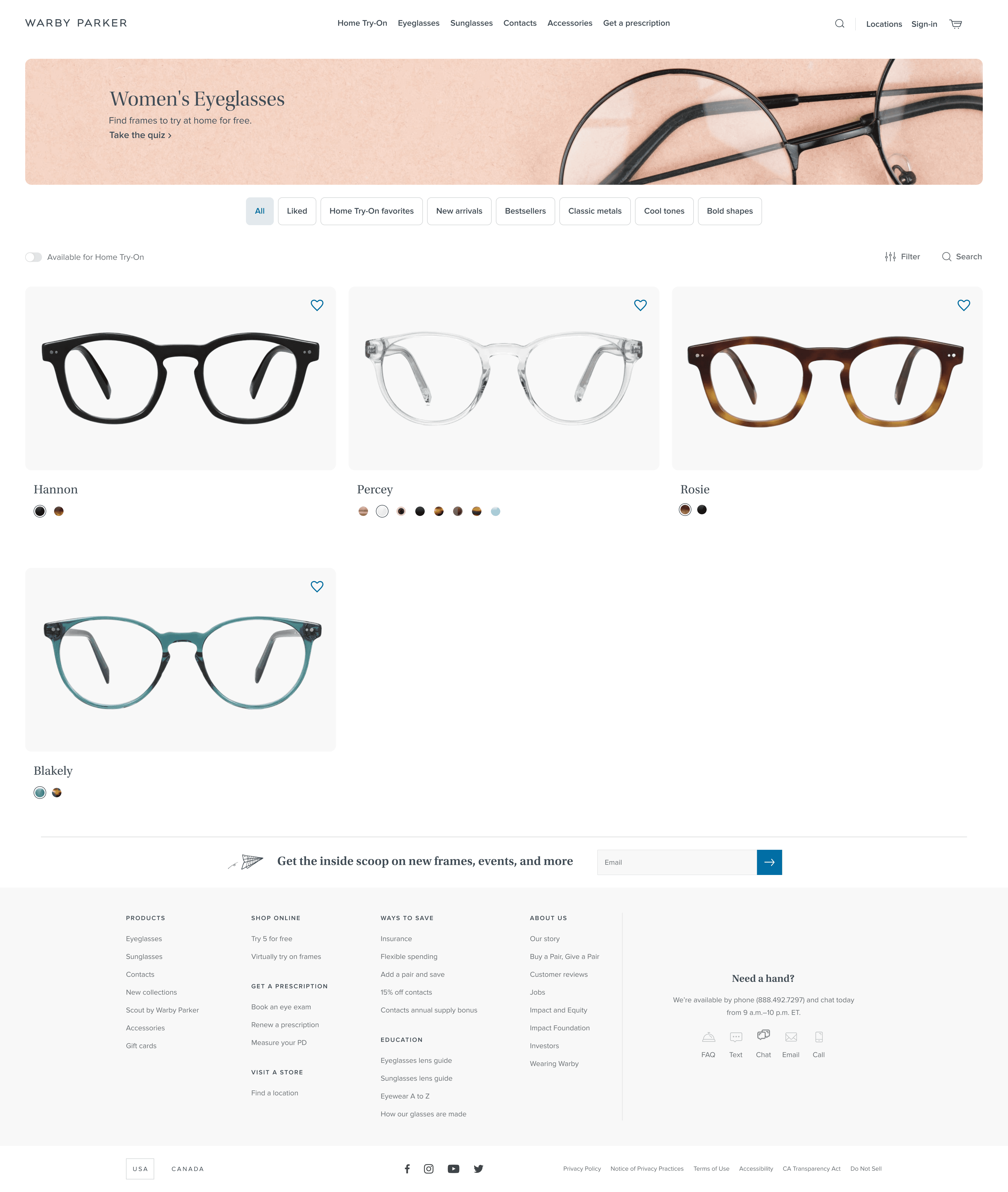
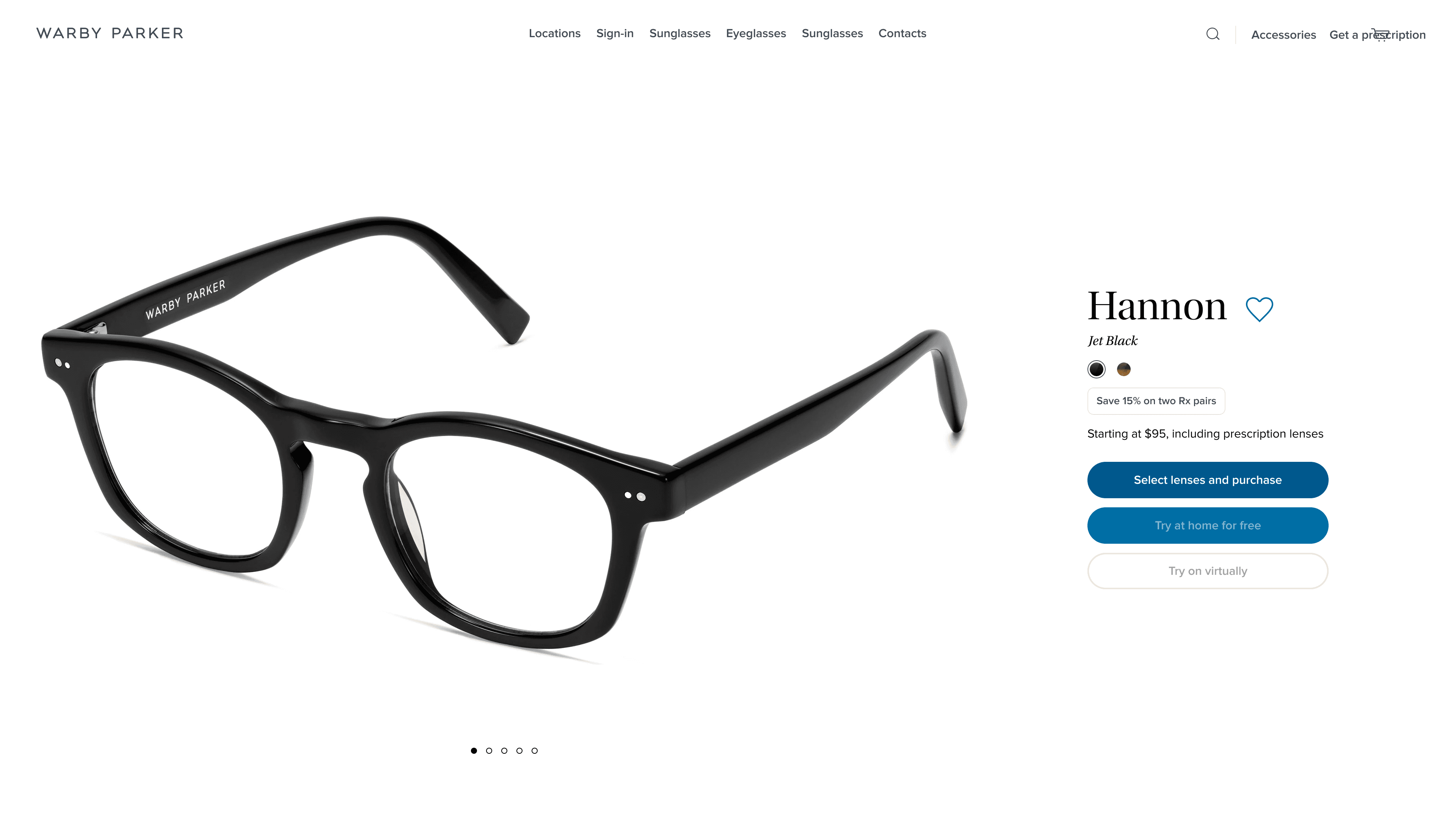
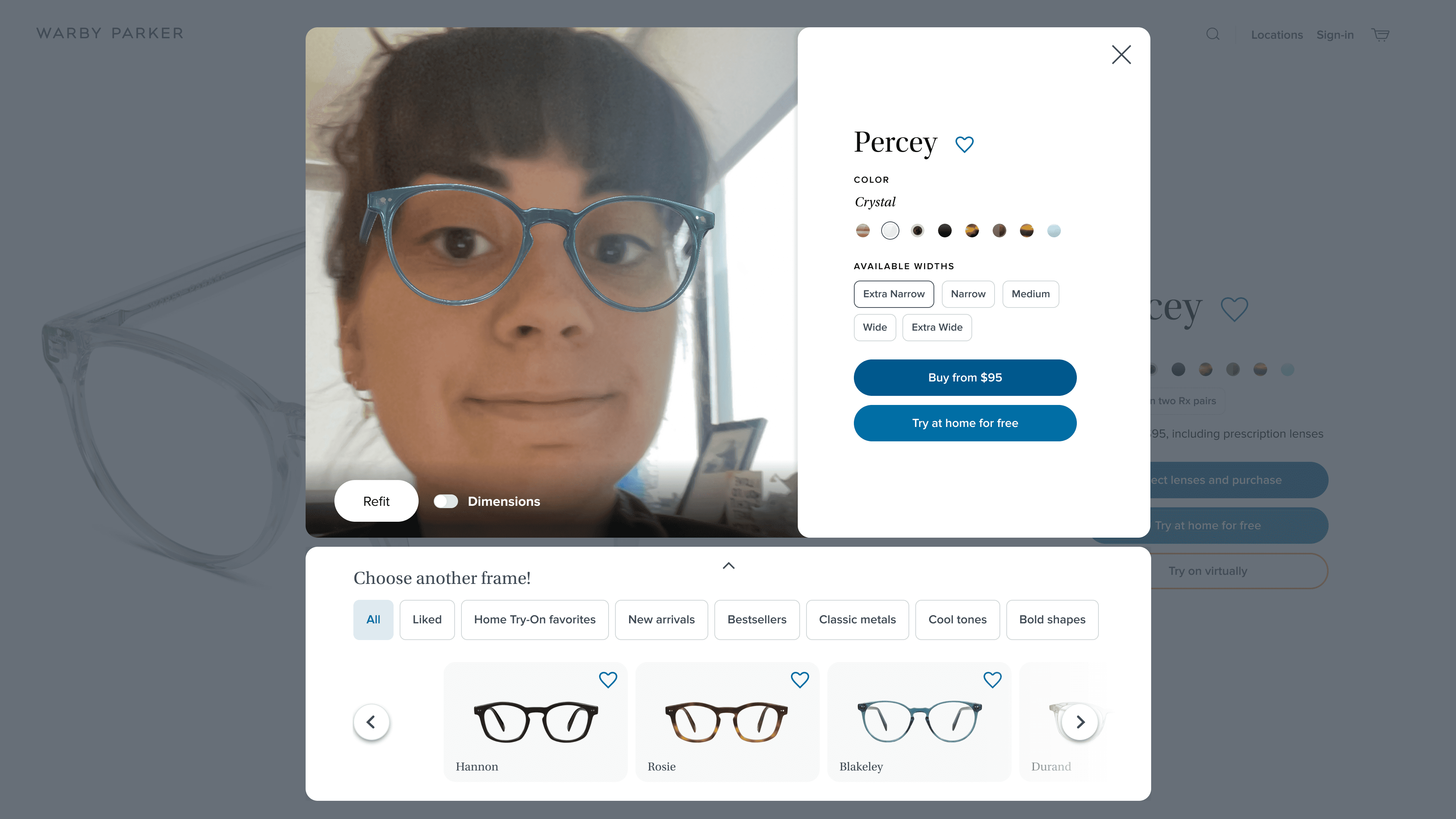
Image: Wireframing
Prototype
Next Steps
Due to time restrictions, we mainly prioritized the frame selection flow (browsing, selecting, trying-on via AR). As a result, the next steps in our process would most likely be finishing our MVP - mainly navigation, a complete homepage experience, user profiles, and purchasing steps. Following a completed MVP, we would ideally conduct usability testing and iterate on the MVP as necessary, before handing off to a team of developers.
Conclusion
Throughout the IterateUX Design Challenge, our team of four:
researched an existing problem landscape by conducting 5 user interviews and 5 competitive analyses
defined the problem through the creation of personas and customer journey maps, which we used to create “How Might We” statements
ideated and created a solution by thinking about how to address the problem
sketched and created low-fidelity wireframes
created a design system
applied the design system to create high-fidelity mockups and a functional prototype.
By enhancing the Warby Parker website Virtual Try-On feature, we made shopping for eyeglasses a smoother and more efficient experience on WarbyParker.com. With the Introduction of additional features, we smoothened the flow and can help increase user trust and knowledge in what they’re buying online.
Challenges
Our main challenge throughout this case study was time. We struggled with identifying elements to focus our efforts on in a limited time period, with only one week for each phase of the project. With each of us also working full time jobs and juggling other commitments, we had very little overlapping availability to meet as a full group. Some features, such as the purchase/checkout user flow, were sacrificed in the interest of time. Additionally, the time constraint didn’t allow us to usability test and further iterate on our designs.
Learnings
Our main takeaway was regarding working with design systems. As inconsistent as it was, we learned how Warby Parker sets up their design system. We learned how they used different weights and sizes of typography to show hierarchy, and found that design systems take a lot of work to set it up, but are rewarding afterwards when creating high-fidelity wireframes. The design system greatly improved our team workflow as we each worked on designing high-fidelity screens remotely.