
Overview
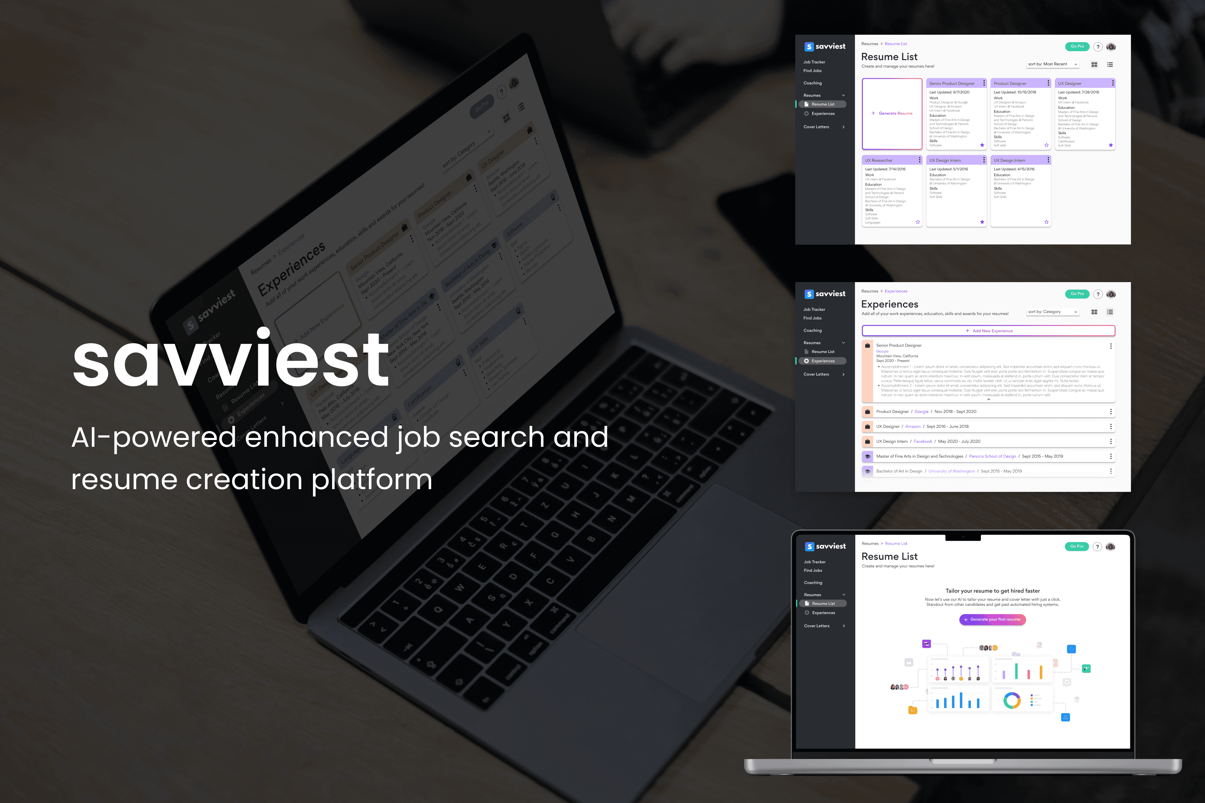
Savviest is a platform that leverages AI and language processing technology to allow users to find more suitable jobs, create tailored resumes and cover letters, and track the entire job application process.
Problem and Goal
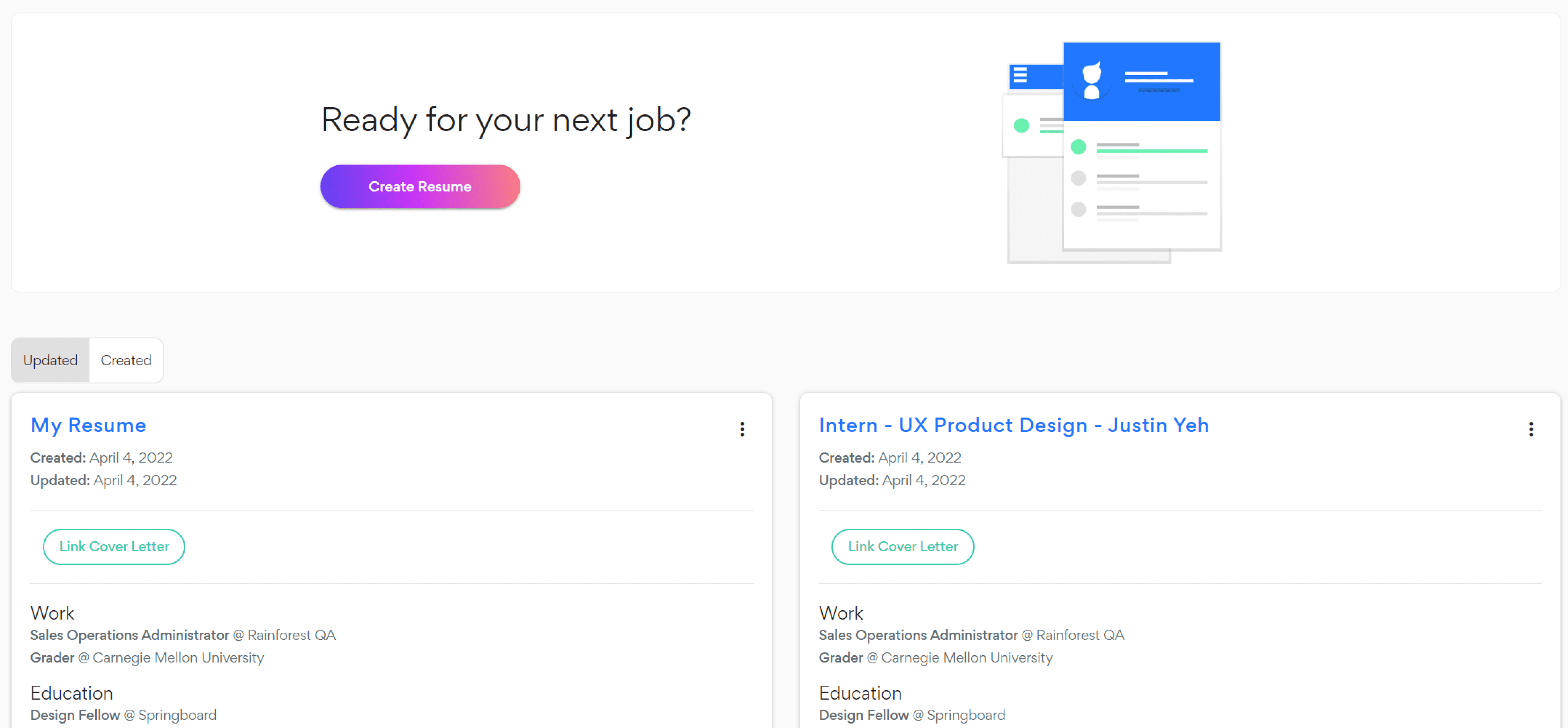
According to their previous feedback, users expressed confusion on having to sort through three separate pages for the experience page. Furthermore, the ability of Savviest to tailor resumes for specific jobs was not immediately apparent from the existing My Resumes page.
Therefore, our goal was to audit, redesign, and test a new Experiences/Resumes page combination that will better communicate Savviest’s core value, is easier to use with multiple documents, and is more intuitive for new users.
Solution
In order to solve their existing problems, we implemented the following:
Improved information architecture
An empty state that better conveys their platform's capabilities
Redesigned experiences and resume pages

Team
Our team consisted of me, and fellow designers Ruth Abbott and Kuan Gao. We worked closely in conjuction with Devin (CEO/Dev), Hannah (Design Lead), and Jared (Cofounder).
Role & Responsibilities
My role in this project included auditing the existing platform, ideating new ideas and translating them to wireframes, performing usability testing, and making changes based on user feedback. I worked alongside two teammates, one of which worked alongside me and the other who worked on another part of the Savviest platform.
Full process below
Understanding the existing problem
We began the audit by creating new accounts on the Savviest platform and doing a deep dive into the functionality of the three Experience pages - Work, Education, and Skills/Awards - and the My Resume page. We input example experiences into the pages and created sample resumes while exploring the site layout.
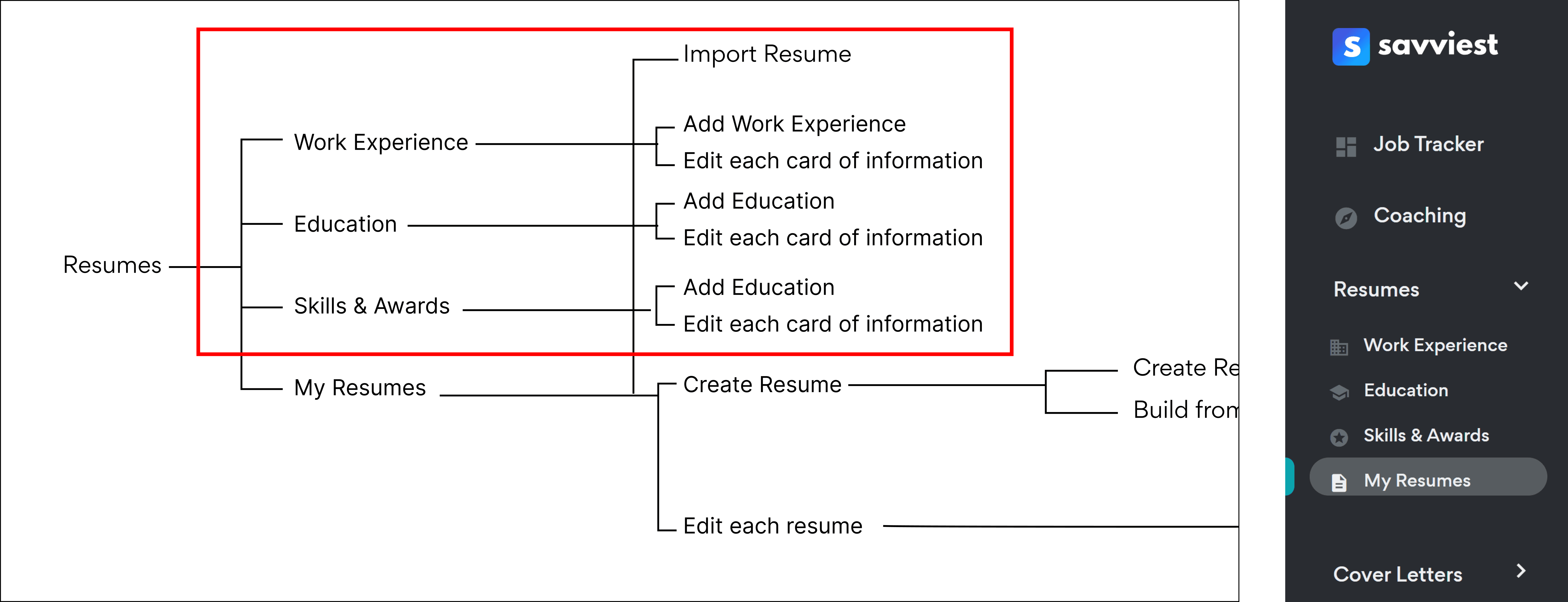
Our first step in understanding the platform was laying out the existing information architecture. Through this, we understood what kind of options and navigation paths users could take, and what functions each page featured. From the IA as well as our previous audit of the experiences/resume pages, we found several existing problems that we wanted to address immediately.
Problems identified
From the IA, we found that the functions available in all three experiences pages were nearly identical. As a result, we felt that users might be confused or burdened having to switch between these pages while using Savviest.
As Savviest stated in our introductory meeting, we found that the My Resumes page was definitely found lacking in conveying the power of the Savviest platform to create tailored resumes using AI.
Part of the reason for that was the lack of clarity in the wording used in the platform - for instance, a word like “create” doesn’t quite convey the usage of AI-powered tailoring.
Ideation
Sketch ideation
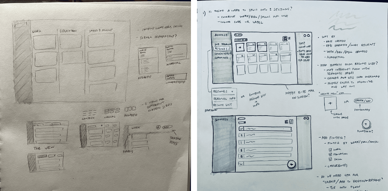
Developed the idea of combining the resume and experience pages and allow the user to assemble their own resume like LEGOs — idea was scrapped due to potential information overload
Explored having a graphic, video, or visual to show how the AI was building out the resume in the backend — scrapped due to lack of resources to procure the visual
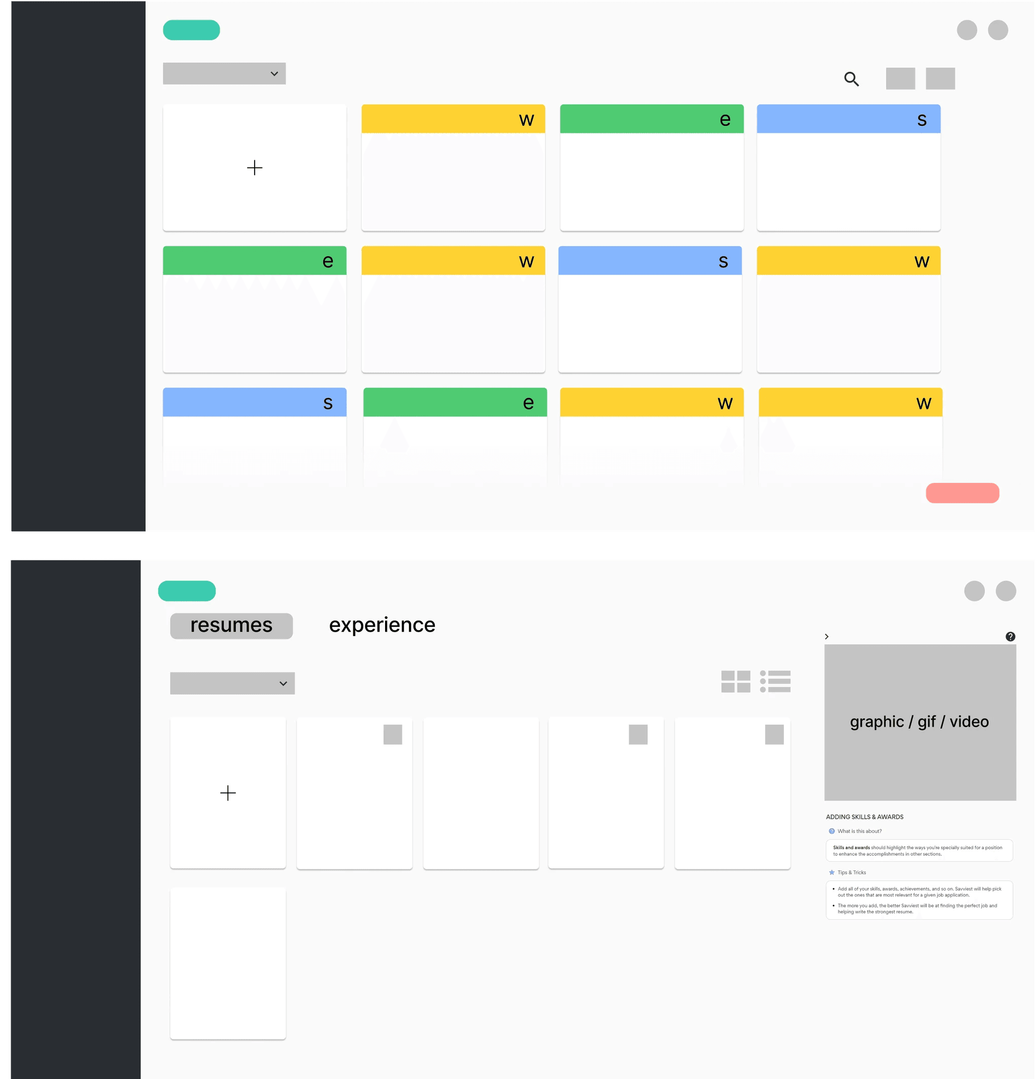
Created card/tile and list views, similar to Google Drive and Windows file management
Low fidelity wireframes
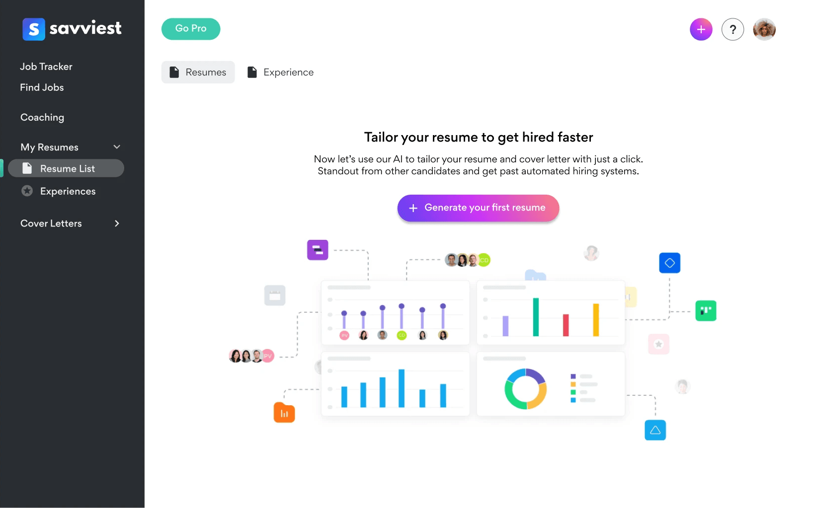
Developed an empty state that would allow new users to know about the value prop - user wouldn't need this information as time goes on so placing it in an empty state prevents it from getting redundant
Added labeling system so users can better distinguish between different types of experiences (work, education, and skill)
Experimented with two methods of navigation - tabs at the top of the screen as well as sidebar navigation
Button exploration
Explored gradients to draw more attention
Ideated copy/language to better convey the power of the platform (e.g. generate instead of create)


Validation
We interviewed four people - current users referred to us by Savviest - to see how they felt about our ideas and if they found navigating the platform intuitive.
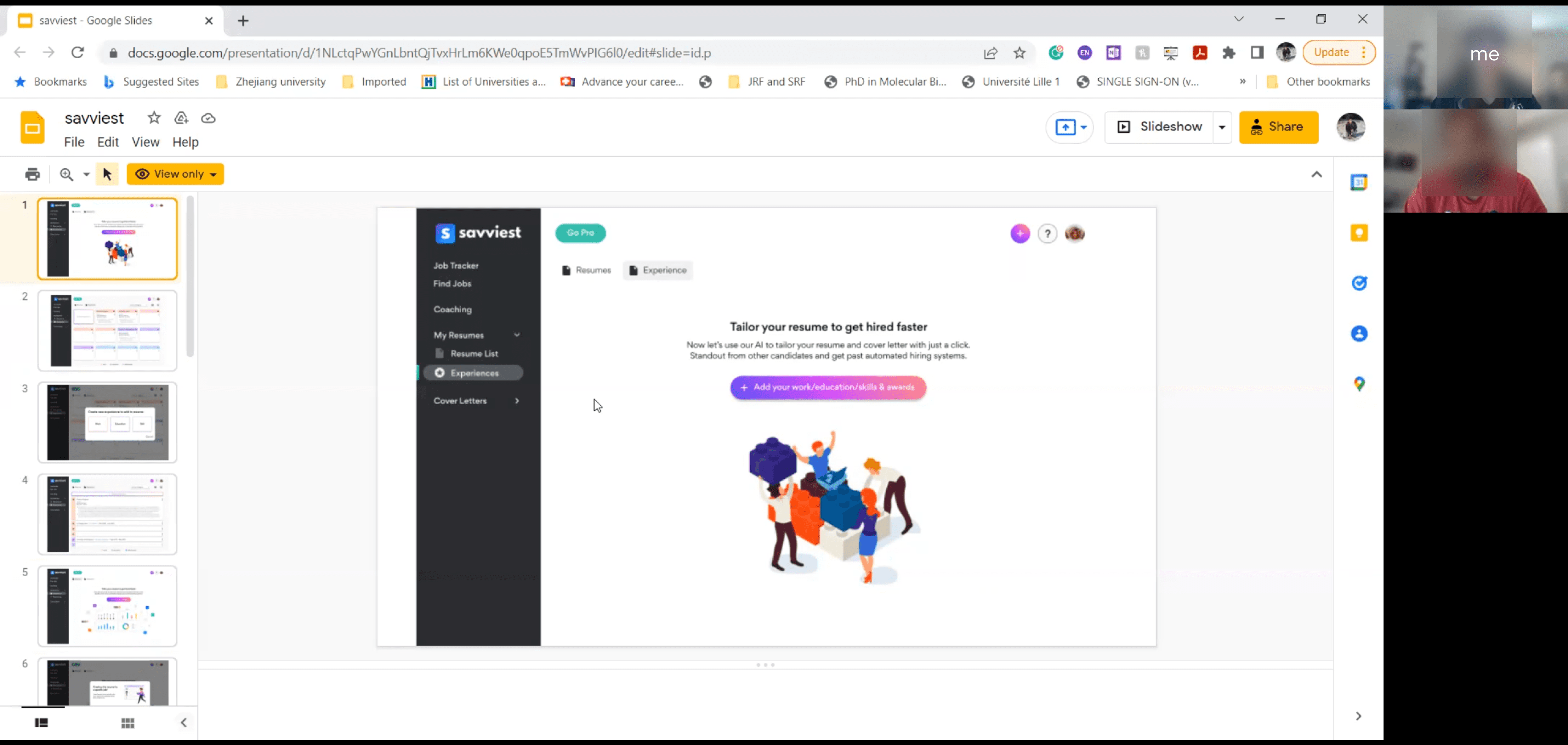
The interview occurred on Zoom, each taking thirty minutes to complete. We created a PowerPoint slideshow featuring static screens that showed the basic idea of the pages, and allowed users to navigate through the platform via their thought process and mouse movements.
After some brief introductory questions and context, we shared the slideshow with the users and requested that they share their screen.
The main questions that we asked involved the users’ mental model of a job search platform that involved creating, sorting, editing, and organizing documents. We asked what the users expected to happen in each interaction, and how they would go about performing certain tasks.
Results
Positives
All users generally found the empty state to be informative and learned that Savviest could tailor their resumes/experiences using AI.
Users found the colors to be agreeable and welcoming
Revealed Issues
One user mentioned that they got lost in the navigation, possibly due to lack of breadcrumbs
One user thought the blue text in the experience cards was a link to the company page or job posting
Two users mentioned that the legend would definitely be important upon first using Savviest, but they would probably start ignoring it as they get used to the platform.
A few users mentioned that the lettering system may cause confusion if they overlook the legend, or if their mental model expects an alphabetization sort of sorts.
A few users mentioned confusion on language used - “create experience” sounded odd to them, as experiences are added instead of created to Savviest
Final Changes
Removed redundant buttons
To address the previously stated problem of redundant buttons, we removed several buttons scattered throughout the Savviest platform that we found to be repetitive or extra.
Breadcrumbs
Due to the prior feedback, we altered the UI and added space for breadcrumbs so that users would be able to know where they are in the platform.
Headers
From the UI changes in the previous step, along with moving the “Go Pro” button to the right side of the page, we found that there was room to insert a page title/header along with a brief description of the page.Widened cards
In order to make the cards feel less cramped, we widened the cards and increased the padding between the icons/text and the edges.Favorited sort
We also thought some users might prioritize certain resumes over others, so we introduced a favoriting system that would allow users to keep those resumes on the top of the page.Text color change to make it seem less like a link
In order to reduce confusion, we altered some text colors in the experience section to the company purple. This would deter users from thinking that clicking on the company name would lead them to a different page.Icons to replace letters
Since we received feedback from the interviews that the letter labeling system may have been confusing, we replaced the letters with icons in an attempt for better clarity and intuitive usage.Modal
We also added icons to the experience page modals so that users can more easily distinguish between icons and mentally attach them to the categories themselves. Through continued usage of the modal, I believe that users will become accustomed to the icons and will not need the legend at all.
Before and After Comparisons
Before
After


Final Prototype
Concluding Thoughts
Next Steps
After the completion of this project, our team handed it off to Savviest developers and designers for future iterating and implementation. Through some discussion, we noted a few potential changes we could make before implementation, such as button UI refinement and dropdown menu placement.
Reflection
I had a greatly enjoyable time working with Savviest and my teammates on this project. The resources provided to us - the existing design system and brand book - were extremely helpful and allowed us to ideate far faster than I’ve ever done before. The professional feedback offered to us in the biweekly meetings steered us in the right direction, and Savviest was very receptive to whatever opinions and ideas we had as well.
Of course, this project wasn’t without its roadblocks. It was definitely a challenge to find a balanced way to allow the Savviest platform to convey its value proposition without taking away from the existing calls-to-action and documents.
It was also my first time working in a more agile-based environment, which came with its own struggles. There weren’t any structured progress markers or hard goals in regards to our work, so I often felt confused about our end goal. However, I feel like through further correspondence, we managed to clarify what kind of expectations were had about the project. Communication was definitely something we developed a bit more through the duration of this project.
The shortage of time limited us greatly - there were a lot of inconsistencies in our designs that I would have wanted to see ironed out - for example, our experiences modal and resume modals are completely different, and the experiences modal doesn't blend into the aesthetic of the rest of the website properly.
As the first taste of actual industry work, Savviest has shown me what I can look forward to at incoming companies and jobs. I greatly look forward to applying my skills in other avenues in the future.