
Context
In UX Scene’s 48-hour-long designathon, my team and I were tasked to address an issue that dealt with inclusivity and accessibility. We won the Best Overall award out of 38 teams.

Problem and Goal
As a few of us often played video games, we recognized that the gaming industry and community were inherently misogynistic and very hostile to minorities and POC. We wanted to address some of these issues and help create a community that fosters inclusivity and accessibility.
Solution
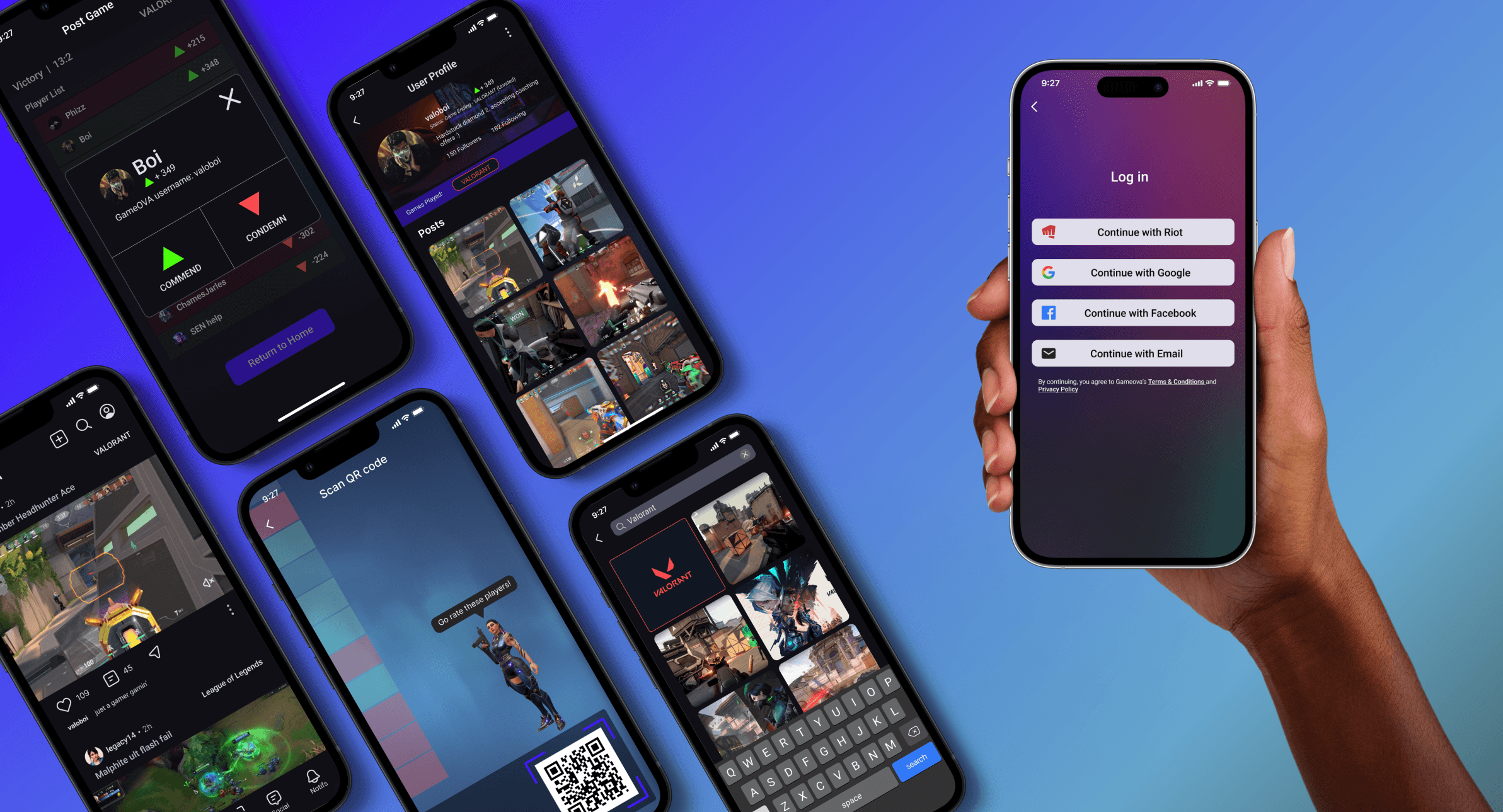
GameOVA is a social media app that connects with all sorts of multiplayer online games that features a cooperation score that players can grant or remove from other players that they’ve played with in the past. The cooperation score will alter the user experience of GameOVA (as well as the games that they play) and incentivize better behavior and less toxicity.
Key features:
Connecting game accounts to social media
The ability to increase or decrease a player's "cooperation score" after every game featuring an AR code
Incentives for higher cooperation score and discouragements for lower cooperation score
Generic social media features:
User profile
A homepage feed with the ability to upload, like, and comment on posts
Game-specific communities

Team
Our team consisted of me, and fellow designers Lauren Hyun, Brandon Belliard, and Sana Parija.
Role & Responsibilities
My role in this designathon included everything from ideation, UX research and synthesis, UX/UI design, and user testing.
Full process below
Understanding the problem
We split the research into two sections: secondary research with various articles and primary research with surveys.
Our research results from both sections offered similar findings - a vast majority of women and minorities undergo harassment and attacks in the gaming industry, ranging from everyday players to high-up positions in entertainment companies, event organizers, critics, and more.

We found that a majority of girls refuse to use in-game voice chat due to previous negative experiences, and after harassment occurrences, they often talk less in-game, play the game less with strangers, or drop the game altogether.

Understanding the problem
In order to get a better picture of our survey results, we used affinity mapping to group similar responses and see what kind of trends existed in the space. We also created a customer journey map in order to see where players encounter their troubles and illustrate how their emotions may change as they undergo harassment.

Through our research synthesis methods, we arrived at the following pain points:
Players feel like current solutions don’t do much to solve the problems
Players can’t use voice chat out of fear of being harassed or feel the need to change their existing voice
Players use voice chat features less (or not at all)
They interact less with the community and stay in their private group of friends.
They feel the need to hide who they are in order to feel safe.
Existing punishments or reporting systems don’t feel sufficient
Through these pain points, we arrived at two main How Might We questions that would allow us to address specific parts of the problem space:
HMW help females/minorities feel that they don’t have to hide their identity or feel comfortable using voice chat?
HMW better enforce consequences for toxicity or harassment in games?
Ideation
We brainstormed solutions for each HMW separately, creating ideas that we thought would address the questions. Through some discussion about the scope and timeline of the designathon, we centered in on an appropriate final deliverable - a social media app.
Our How Might We questions allowed us to better focus on coming up with potential ideas for dealing with the problem.
An idea that was quickly trashed was a voice changer or automatic voice muter for toxic players - we felt that it was a band-aid solution that didn't directly deal with the problem.
Another solution we thought of was an entirely new reporting/moderation platform that would feature a tribunal system of sorts that would allow the platform to crowdsource women and minority gamers to help moderate player behavior. However, we felt that this would be too complex of an idea for a 48-hour designation.

Keeping in mind our contextual limitations, we created our product - GameOVA - a social media platform focusing on gaming that involves a cooperation score that would directly impact player experience in both the app as well as in their own games. Like most social media apps, GameOVA would allow users to post and share content such as videos, pictures, posts, questions, and more. Our primary inspirations were Reddit, TikTok, and Instagram, all of which have wide audiences and robust content-sharing features.
The idea was that players, after playing a match in their specific game, would be allowed to add or remove a singular cooperation point from someone they enjoyed or disliked playing with.
These cooperation points would allow users to see which players were pleasant or unpleasant to play with before a game starts, and react and/or prepare accordingly
A low cooperation score would in theory lock users out of certain parts or features of the application, and the player would be placed in lobbies with similarly scored players.
A high cooperation score would grant the player benefits such as badges, achievements, higher content viewership priority, and even in-game cosmetic rewards or discounts on microtransactions.
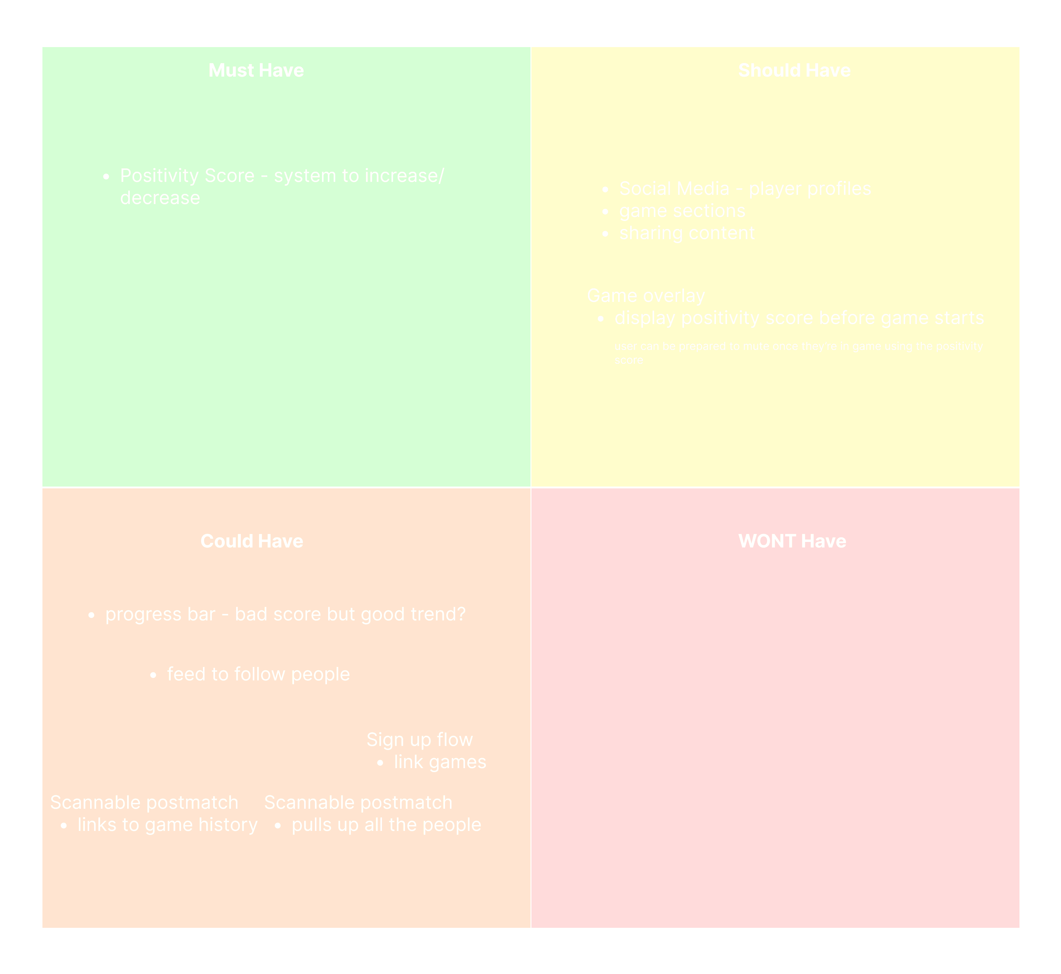
We came up with basic features that we felt like would probably encapsulate the general idea of a social media app, and performed a quick MoSCoW map - which determines our must haves, should haves, could haves, and won’t haves - to prioritize and focus the features for our MVP deliverable.
Interestingly enough, we didn’t have any features that we included in our “won’t haves” section, which meant that we might have been too conservative in our features brainstorming.

Sketching and Low to Medium Fidelity
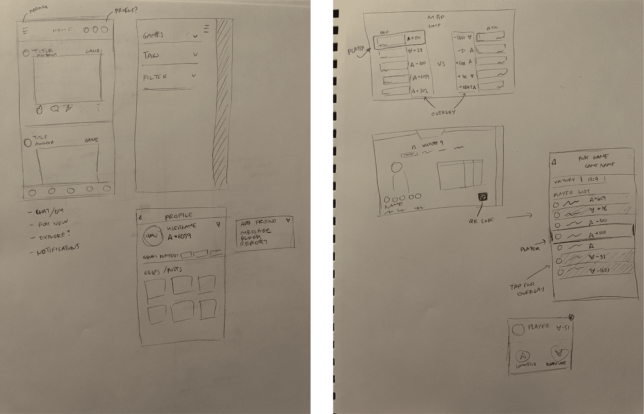
After our ideation, we moved onto low fidelity sketches just to get an idea of how we wanted our app laid out. We all focused on a few separate features - I mainly sketched my own version of the homepage, a user profile page where they can view their cooperation score, and an in-game layover where players can access the app through a QR code, where they can rate their in-game teammates.

Due to our time constraints, we moved directly to low to mid-fidelity prototypes. We created our onboarding flows, homepage, profile page, search feed, game-specific space, and in-game overlay (which we only created for Valorant for the time being).
Personally, I designed the player profile page and the homepage, and edited the layout for the game-specific pages and threads. I also created the in-game overlay, the post-game player list, and the cooperation score modifier screens.


Our makeshift design system can be found below with our components, icons, and color palette. The team felt that the color palette I selected best represented a gaming community - I chose a blue-purple, combining purple’s meanings of power, dignity, and mystery with blue’s calm, trust, and loyalty. I do admit that I did draw some inspiration from typical gaming RGB lighting though. However, we didn’t apply the palette to the designs as it was developed alongside the medium fidelity wireframes.
We decided to go with the Roboto typeface as it was one of the most commonly used sans serif fonts. Given that it was the default Android font, we felt that it had enough familiarity where users wouldn’t have to spend unnecessary time adapting to something new.
Another member of our team was responsible for choosing the iconography and obtaining other assets for our components.

Validation
We managed to find three users for last minute user-testing. Our main goals in user testing were to find:
How smooth and intuitive was the onboarding process?
How easy is it to navigate the app (giving them a task to navigate to a specific page)
How easy is it to use the AR scanner to navigate to the post-game player list and modify another player’s cooperation score?

As you can see from the above image, our highest misclick page/feature took place on the app navigation task. In the post-task questions, a few users had trouble navigating the application due to vague icons.
Another problem we encountered was that users found the wording in the sign-up flow to be confusing, resulting in its low success rate. Our task was to create an account and link the user’s Riot account - users were unclear about whether to click the “Sign Up” button or the “Use your Riot ID” button.
One user also mentioned that the middle button - which housed the AR scanner function - was not very intuitive and didn’t quite convey to them that the scanner function would be found there.
Final Iterations
In our final iterations, we applied our design system towards our high fidelity designs and we addressed the problems that we found in the most recent stage of user testing.
In order to increase accessibility and reduce confusion among users for app navigation, we labeled the buttons and changed a few icons. We gathered a few versions of what we thought would be more representative of an AR or QR code scanner icon, and settled with a simple final version.
We also moved the create post button to the top navbar in order to differentiate the scanner button and new post buttons. We figured that the functionalities of the features were different enough where it wouldn’t make sense to include them in the same button, and would cause confusion if we did.

As you can see from the above image, our highest misclick page/feature took place on the app navigation task. In the post-task questions, a few users had trouble navigating the application due to vague icons.
Another problem we encountered was that users found the wording in the sign-up flow to be confusing, resulting in its low success rate. Our task was to create an account and link the user’s Riot account - users were unclear about whether to click the “Sign Up” button or the “Use your Riot ID” button.
One user also mentioned that the middle button - which housed the AR scanner function - was not very intuitive and didn’t quite convey to them that the scanner function would be found there.
Final Deliverables
Design System

High Fidelity Screens

Happy Paths

Figma Prototype
Next Steps
The next steps for GameOVA, if slated for continued development, would be the fleshing out of the other features in the app. Features that would need developing include the social tab for friends, clubs, and chatting, as well as the notifications tab. We'd also need to prototype the ability to post, share, like, and comment on content. More progress in the profile section would be needed as well, allowing users to follow, block, and report other players. Another element we want to implement is customizable AR characters.
Assuming a GameOVA company exists with sufficient staffing and funding, we'd then hopefully hand off the product to our software development team.
Challenges
Some problems we ran into related to time management. We had trouble allotting time for each section of the design process, especially for research, and experienced difficulties in finding usability testing subjects. We also definitely struggled to coordinate our availabilities and timetables throughout the 48 hours.
We also encountered a few emergency issues, such as a member dropping out due to COVID and another member being locked out of commission for several hours of the project. However, we persisted through the issues and learned how to effectively split up tasks among the available group members.
Reflection
We're proud of creating a cohesive product in under 48 hours, especially after going through the previously mentioned emergency issues. Not only did we manage to test our product and acquire user insights, but we also developed a basic design system with a color palette, typefaces, and iconography that we implemented into our final designs. We came out of the project more experienced and hopefully as better designers.
Apart from more effective time management and task delegation, we learned to prioritize creating a sufficient MVP that would allow us to user test for fast feedback and iteration. User insights provided feedback that we designers weren't able to identify as quickly.
We also enhanced our ability to use components to save time and allow for global changes across our files.