

September 2023 to December 2023
Overview
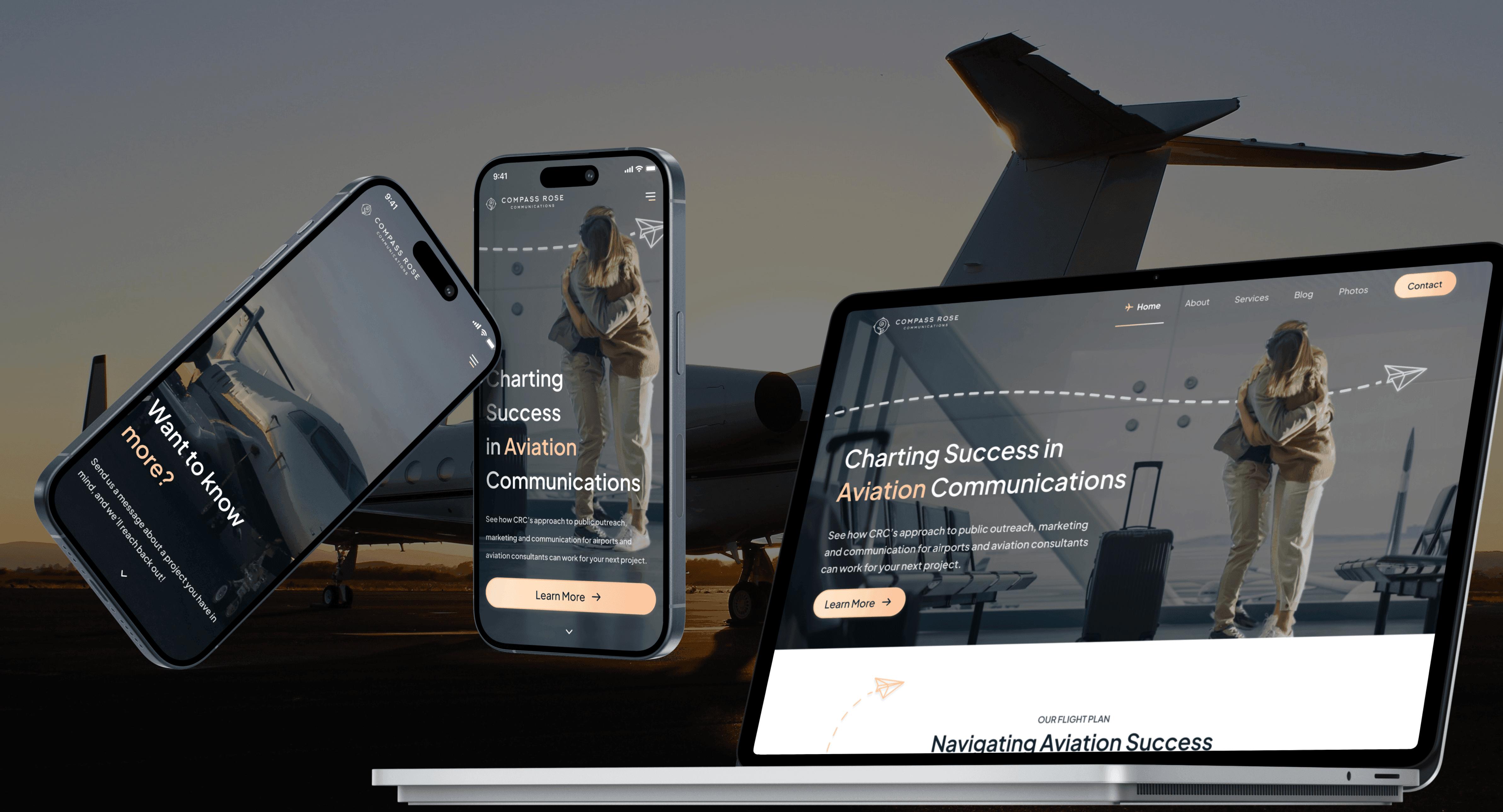
Compass Rose Communications is a new aviation communications and outreach company spearheaded by experienced City of Scottsdale Aviation Planning and Outreach Coordinator (now CEO of Compass Rose Communications), Sarah Ferrara.
Role
Through Oxy, I was brought onto the team to lead the design efforts to create Compass Rose Communications' website and brand identity, given only their logo.
Problem
Our client intended to establish a brand new aviation communication company in Phoenix, Arizona, and came to Oxy to request that we help her build a new website from scratch.
Deliverables
Through the course of this project, I produced the following deliverables:
Sitemap
Moodboard for initial exploration
Wireframes
High-fidelity frames after style/branding direction was determined
Team
Our team consisted of me and the occasional feedback of my senior designer Anthony Ferrara (lead designer and CEO of Oxy). We coordinated with Compass Rose CEO Sarah Ferrara.
Full process below
Sitemap
We began by creating the sitemap of the website using the required sections given to us by our client. After observing and analyzing other existing aviation and PR companies to see what the common practice was, I created the following sitemap that I thought would be appropriate for Compass Rose Communications.

I ensured that all similar content were grouped into their specific pages (e.g. join the team on About page). We ended up combining the projects and services page to show examples of the types of services offered by Compass Rose.
Moodboarding
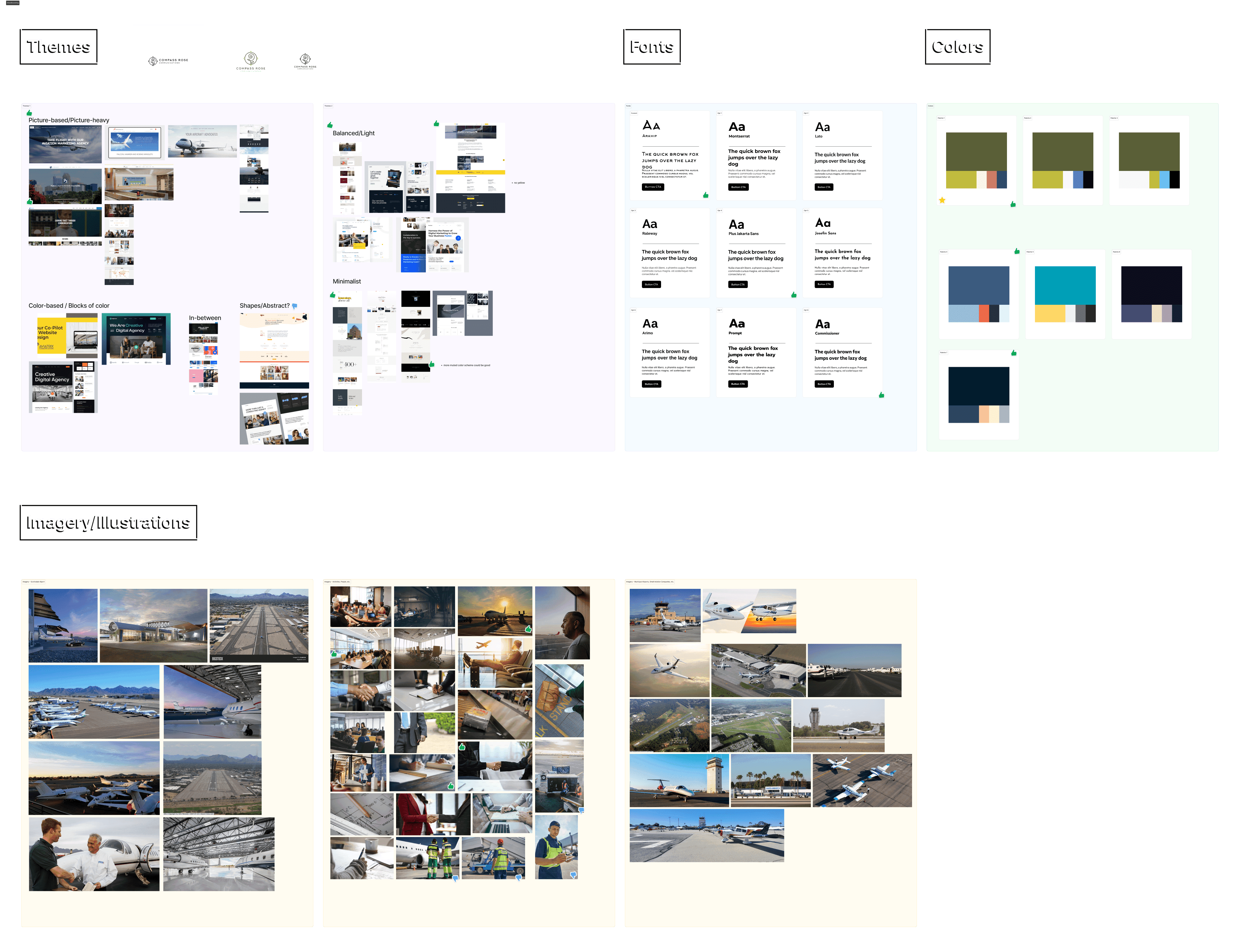
I looked at various existing companies for inspiration, such as other aviation and PR companies. By consulting with our client on these, along with font, color palette, and imagery styles, we were able to determine how we wanted to proceed exploring the brand and UI design.
Wireframes
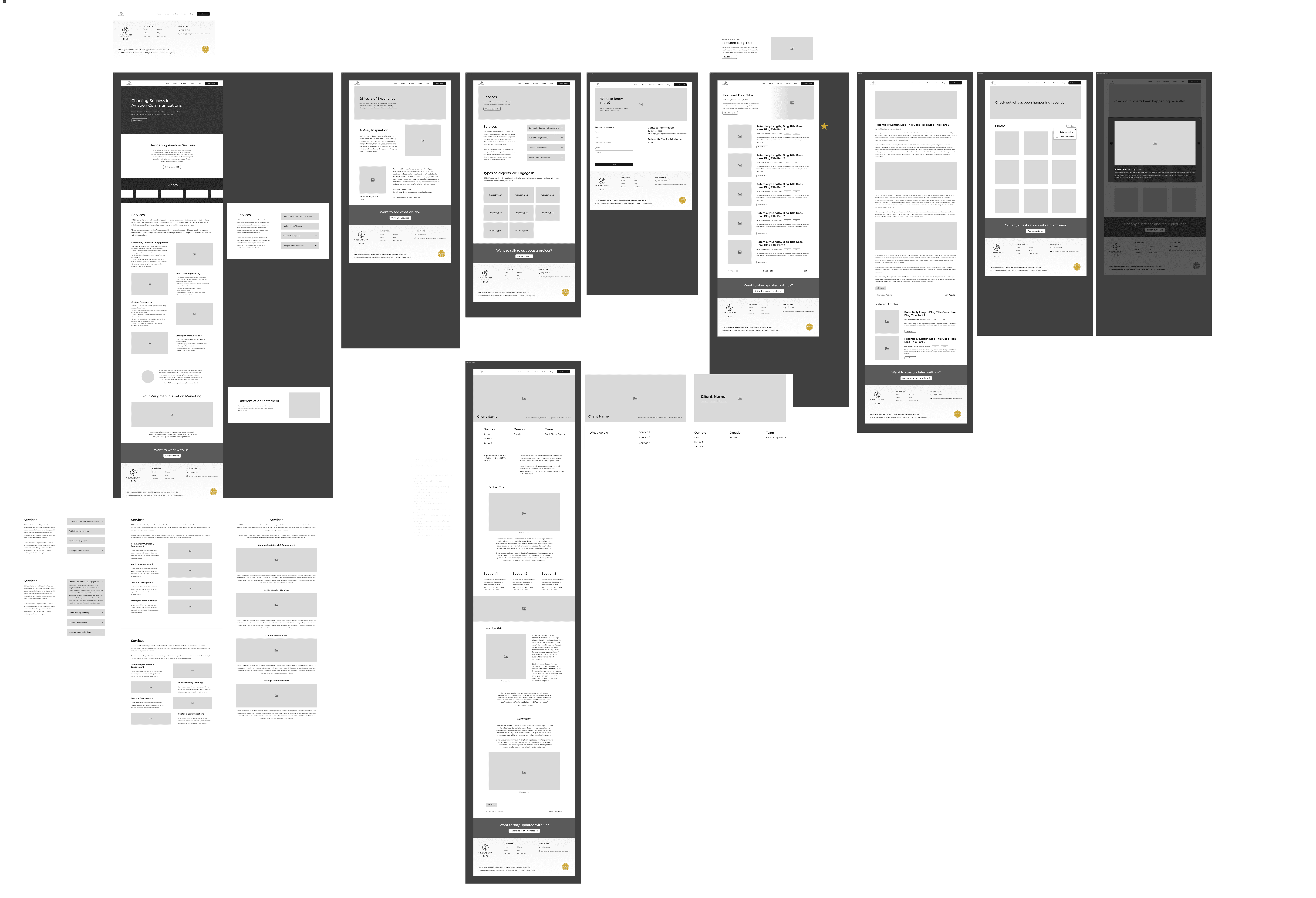
Our client determined that she liked simple UIs with blocks of color and image backgrounds. This allowed us to create the following wireframes.
The following pages were completed:
Homepage
About Us
Projects page + sample case study
Contact Us page
Blog/news/media page + sample article
Photos page
I definitely had some trouble trying to balance blocks of color, imagery, and minimalism and attune it to our client's liking, but thankfully we ironed it out quickly through a few series of Zoom meetings.
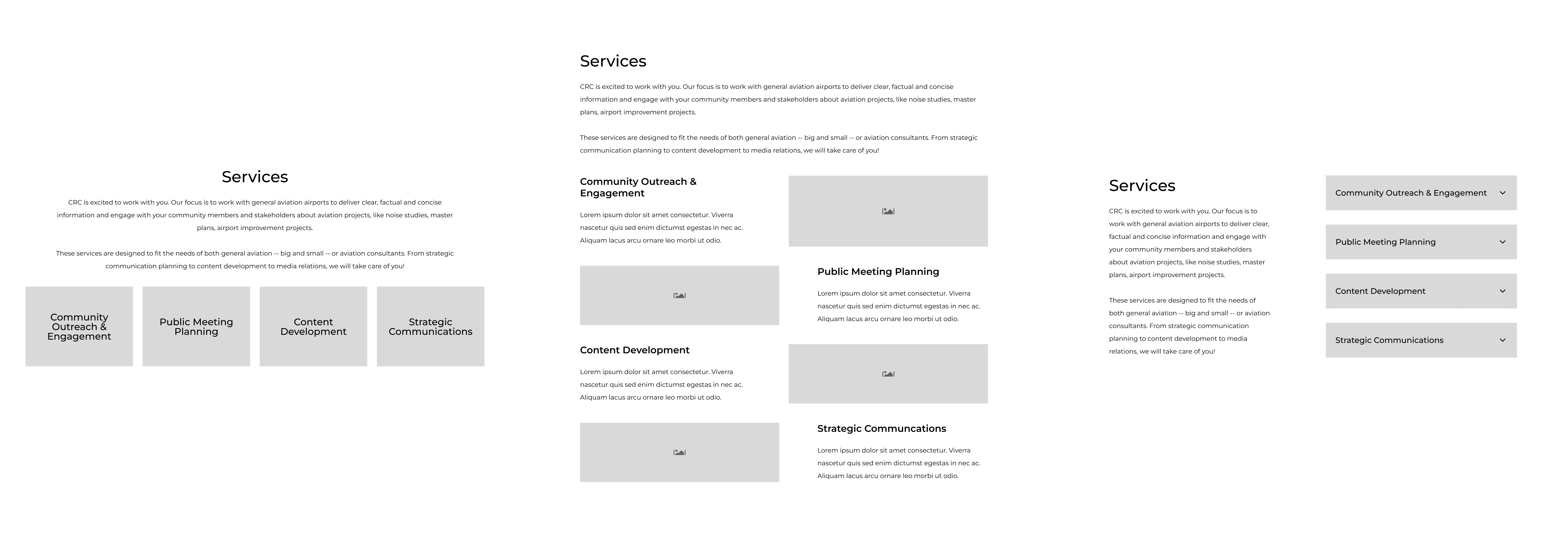
Wireframe Iterations - Services Page
One section I had a particularly hard time deciding how to lay out was the services section on the homepage, where CRC would state and describe its various offered services.

After talking it through with other designers and the client, we arrived at the final iteration (with two variations):
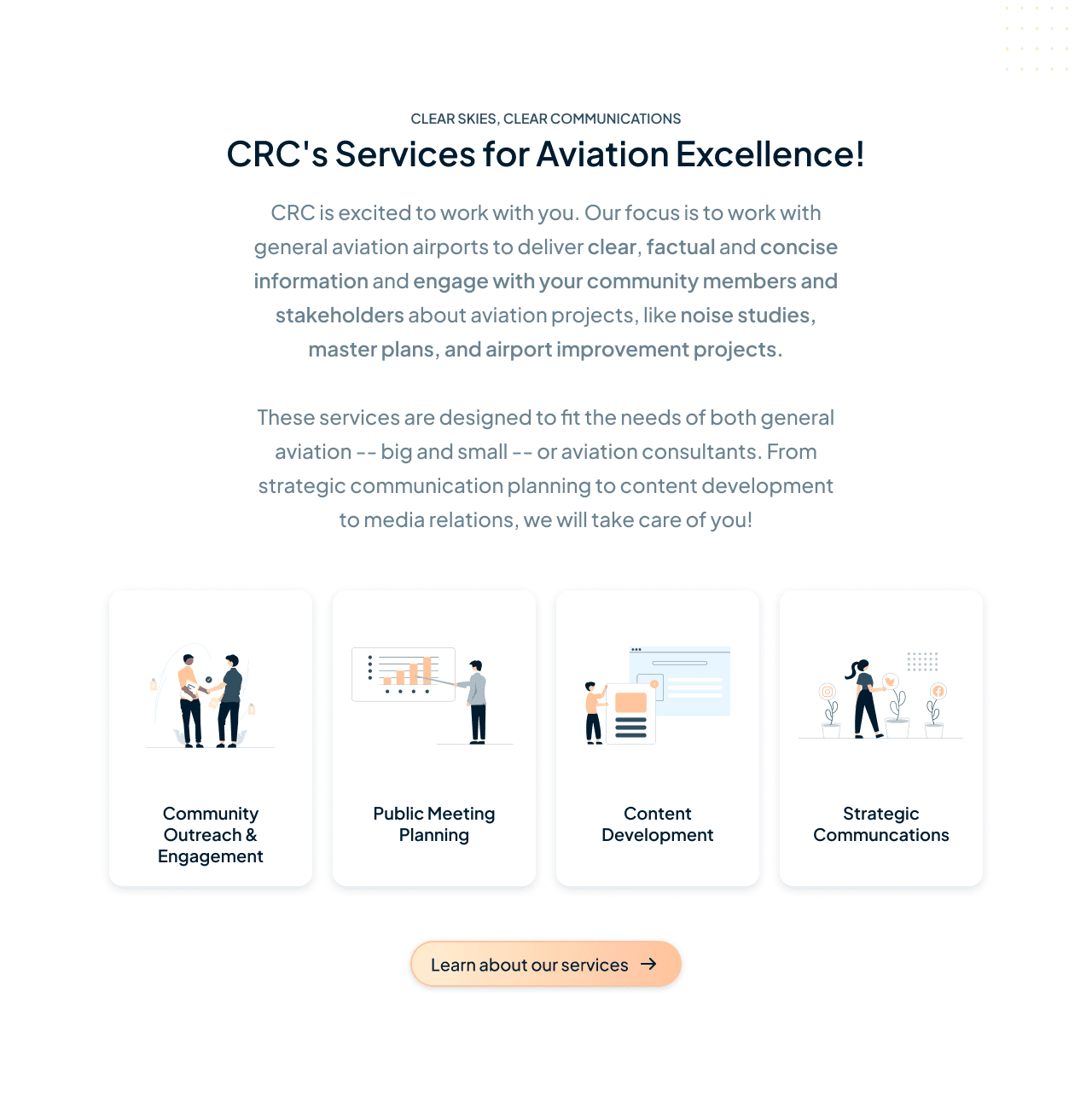
Services Section - Homepage
I decided that it wasn't important for the specific information of each service to live on the homepage - especially if we had another page dedicated to it
Used icons for enhanced storytelling as well as create a sense of youth and warmth
CTA to direct interested customers towards the services page, where a more detailed explanation would live along with example projects
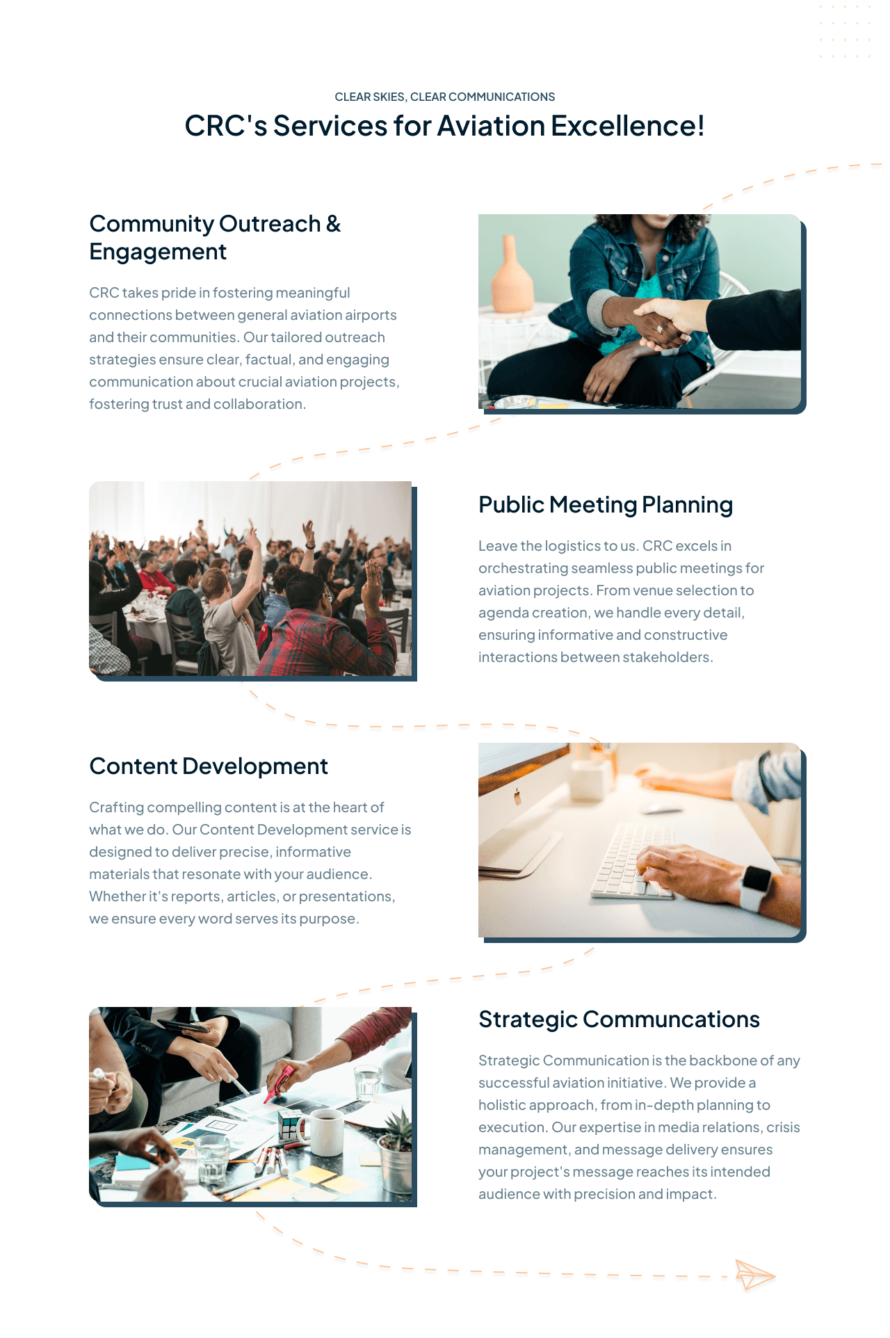
Services Section - Services Page
Offers the full details for each service, as well as example projects below
Uses subheaders/labels for easier scannability via Z-pattern/zig-zag pattern
Descriptive images to assist in user understanding (especially if they scan/skip through the text)
A decorative paper airplane trail that winds through the images to direct the user's pathing
Image border to prevent low-contrast edges
Wireframe Iterations - Individual Project Page Intro Banner
Another section we iterated on was the header/introduction for the page reserved for previous projects.
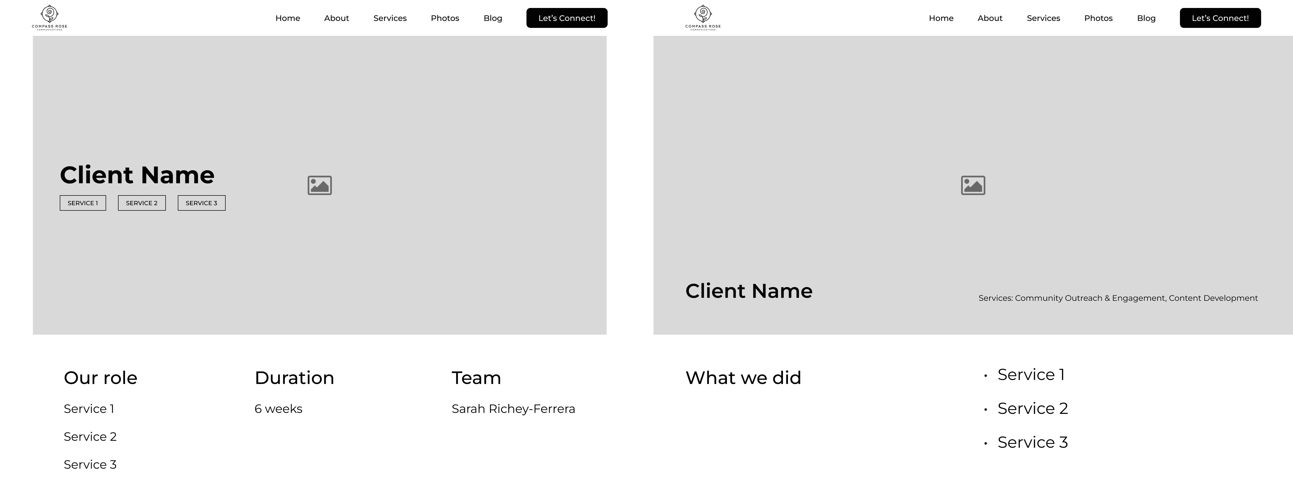
After another designer and client review/critique, we arrived at the final iteration:
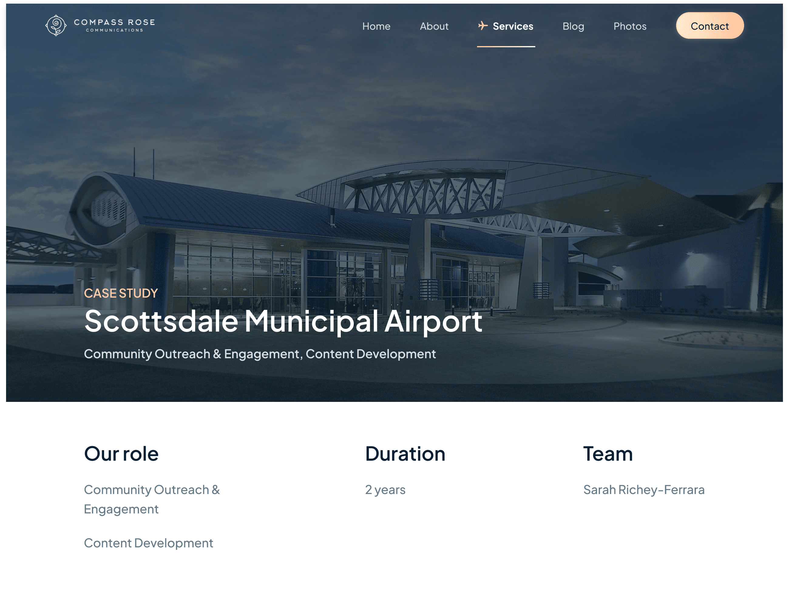
Final Project Banner
Added Case Study label on the top of the client name/project title for further clarity and to take into account future non-case study pages
Moved performed services/role below the title to ensure ample space for more than three to four at once
Moved the text towards the bottom of the section for consistency across the website
From this, I definitely developed better thought processes for information display and hierarchy. I feel like having two different role sections is a bit redundant, but I wasn't sure if I should make sure that it was included within the actual project content instead of just the intro banner.
Extra Feature - Current Navigation Indicator
One issue that I played around with was exploring how to let the user know what part of the navigation they were currently on, as to not let them get lost in the potential sea of pages.
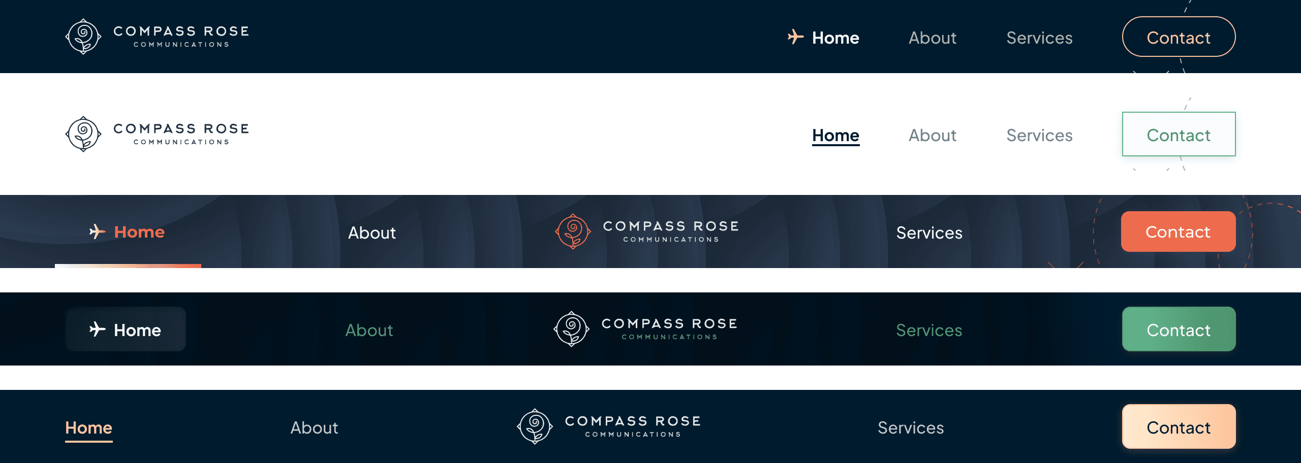
I ended up deciding on the plane (as it felt like an appropriate and rather cute substitute as a pointer or arrow) combined with the gradient underline, as seen below. Making sure that the text met WCAG standards was important, and the gradient allowed us to incorporate a little bit of our secondary colors for a bit of personality.

Finalizing the style
Through multiple series of iterations, we determined the direction we wanted the brand styles and colors to look like. In the beginning, the plan was to incorporate the greens from the logo into the aesthetic, but our client liked the deep blue and peach variations of the UI so much that we decided to forgo the colors from the original logo.
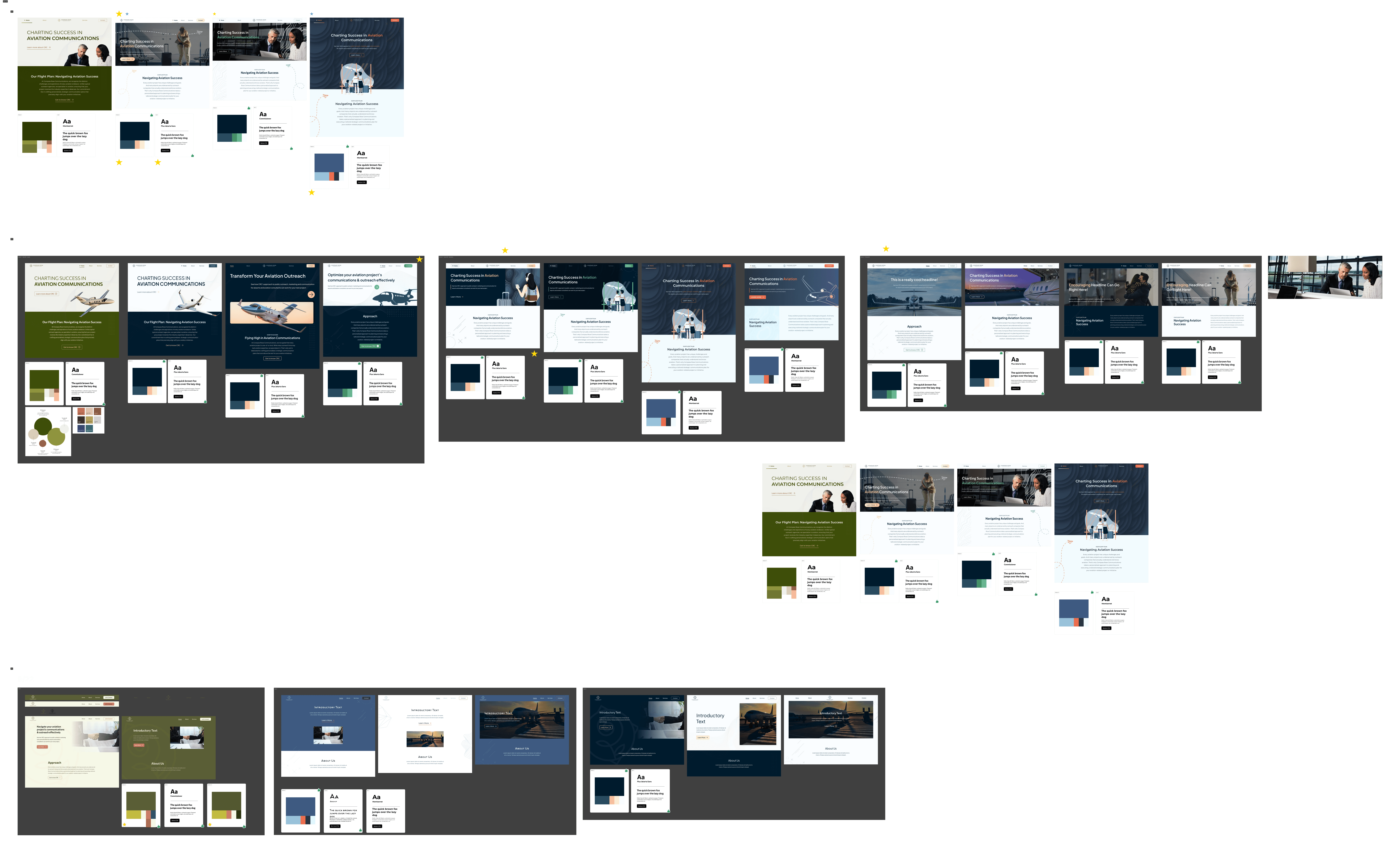
I explored a few variations of styles, such as using cutout images or illustrations, but the client ultimately decided that she felt the full stretched image backgrounds would allow for the best displays of photos and would be best suited for her website.
Although we didn't go with these variations, I'd say I'd consider the following favorite iterations that I created.

Final style guide

I decided to go with blue and peach theme, as it evokes trustworthiness and formality without being too drab. I noticed that a lot of aviation companies liked red or orange accent colors, and felt that peach provided a suitable contrast while conveying a softer and less strident environment that orange would have created.
Applying the style to the high-fidelity frames
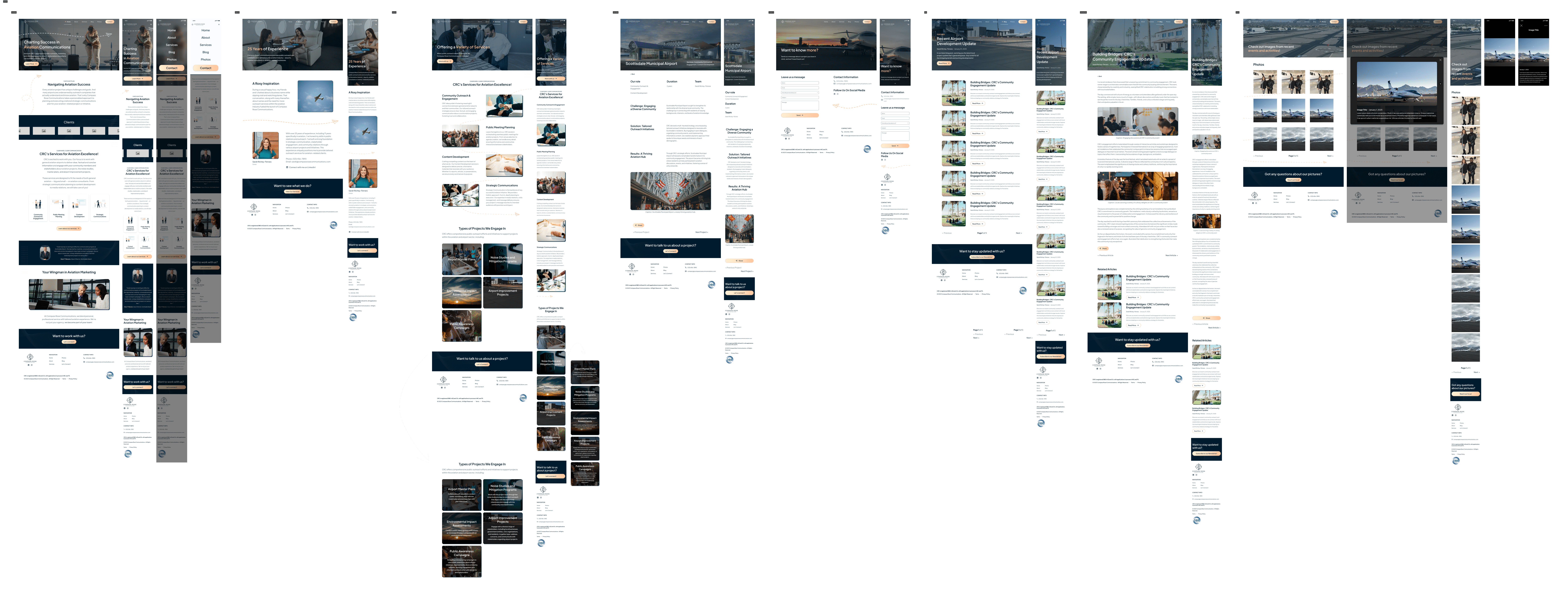
In the final phase of this initiative, we applied the previously decided style guide to the rest of the wireframes.

Next steps
Although near finished, our final steps are obtaining the last parts of the web copy from our client - such as her own case study and blog articles - and then handing it off to our developer to assemble in Webflow.
Determining Success
In order to track our success for this project, I believe we'd need to keep track of these main KPIs:
Unique visitor sessions (to track how many people are visiting the site)
Low visitor rate could be a result of poor SEO
Conversion rate (to see how many users contact our client for their services)
Bounce rate (to see where the sales funnel falls apart)
Unfortunately, our client never got back to us with exact values.
Reflection
I greatly enjoyed working with Anthony and our clienton this project - I loved being able to take responsibility for the whole project and felt empowered to make design decisions I didn't think I was previously capable of. I definitely felt like I improved my skills in interfacing with clients, and felt like I stepped up my visual design skills a notch. I look forward to what comes next.
